Goldenrod
Brand Development | DesignBrand development for a rural destination diner.
Scope + Deliverables
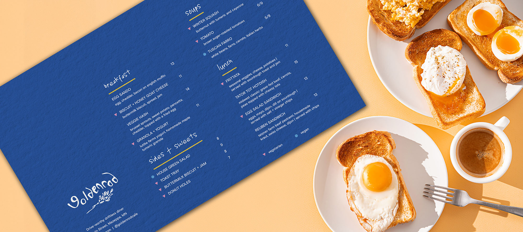
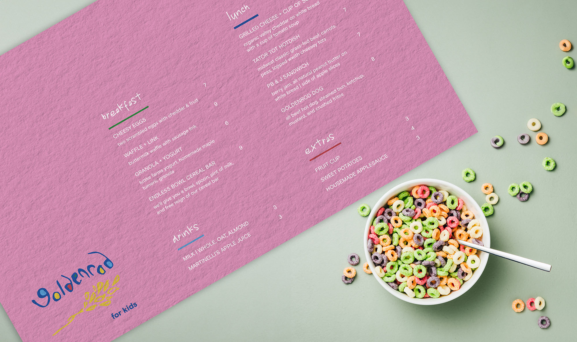
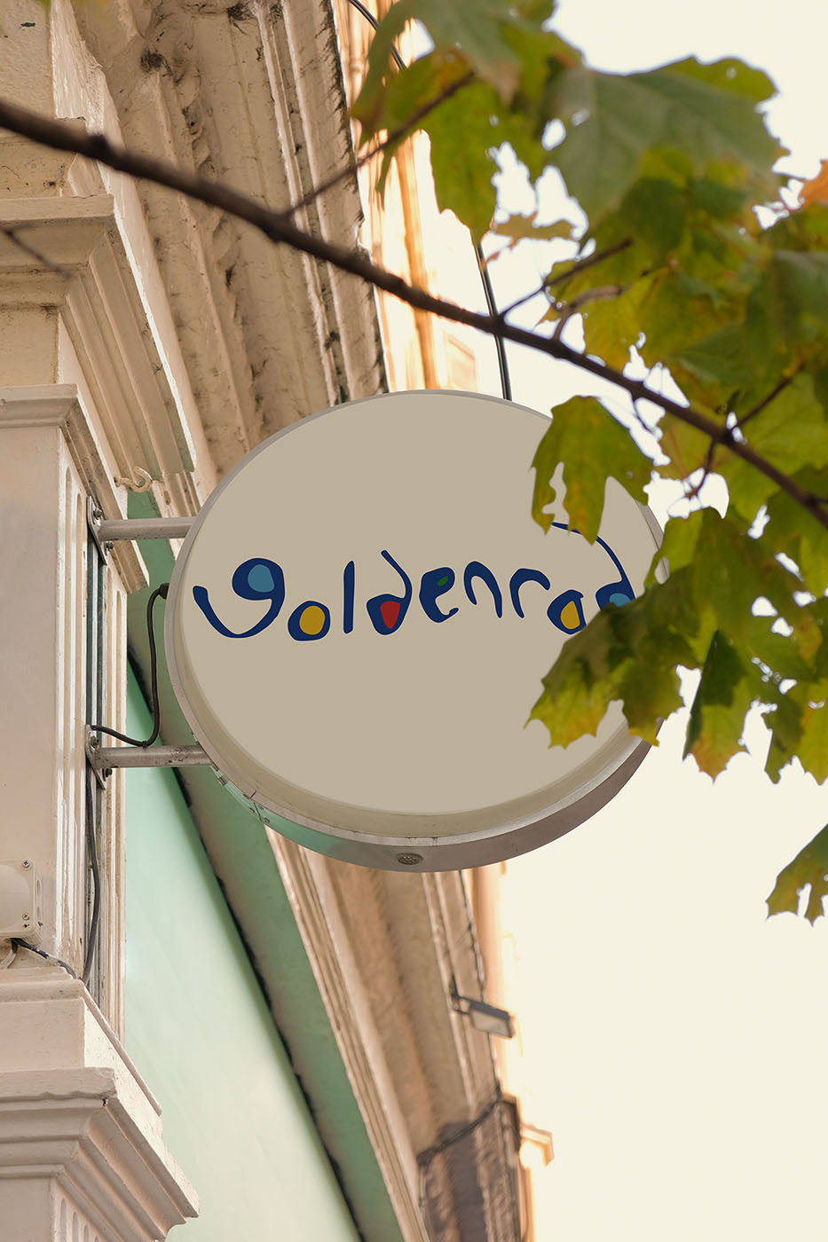
Market research, concept development, logo, signage, menus, and additional assets.
Brand Approach
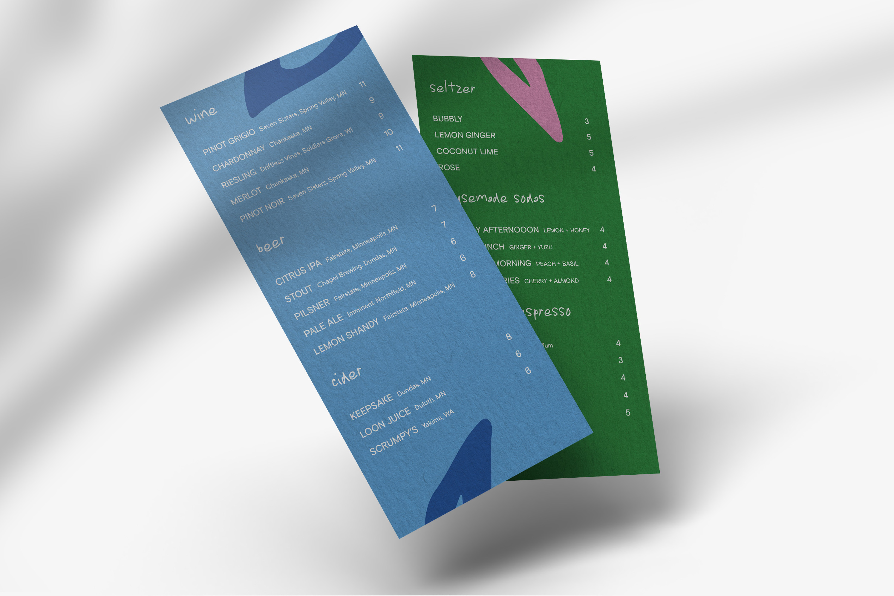
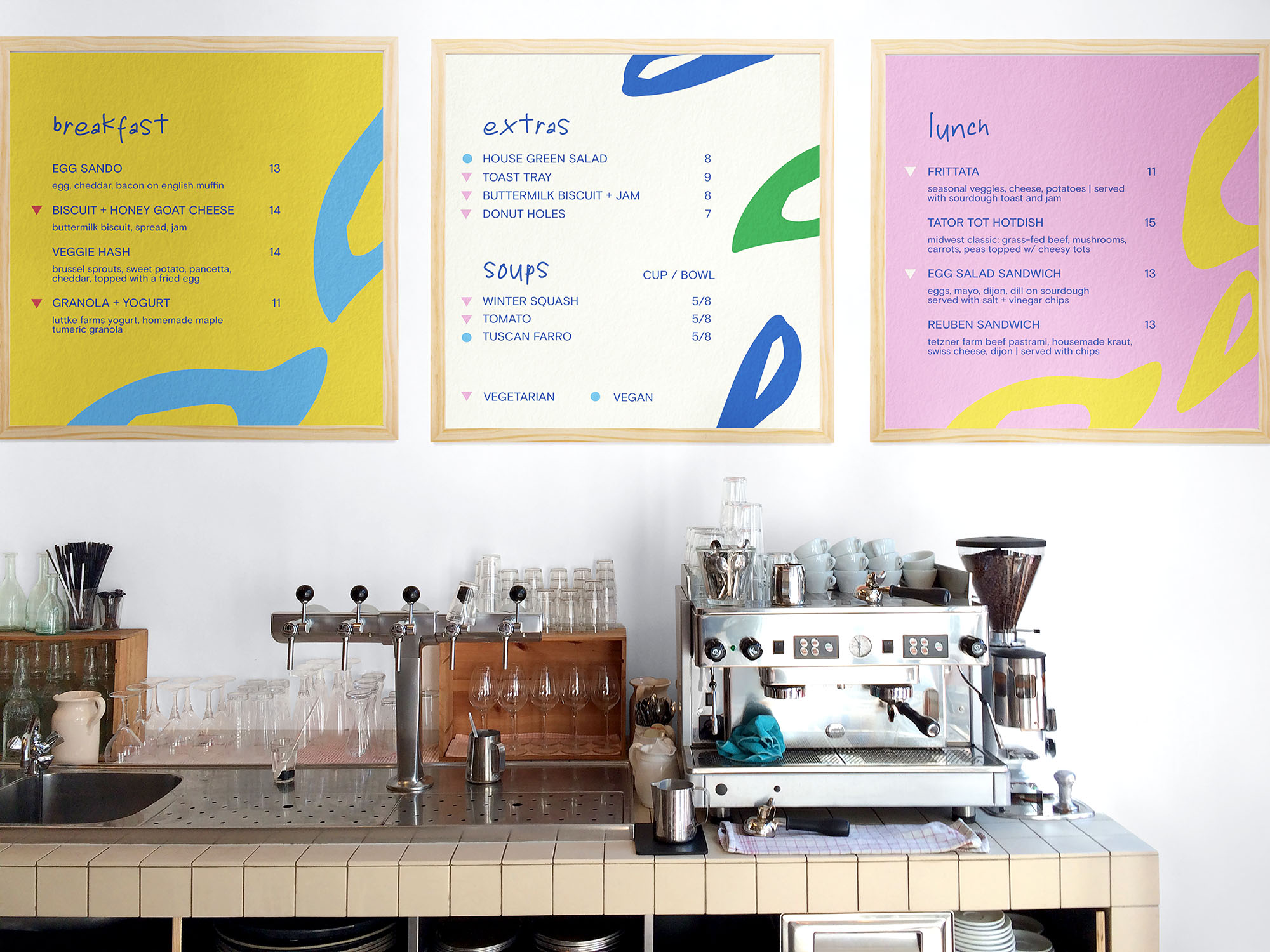
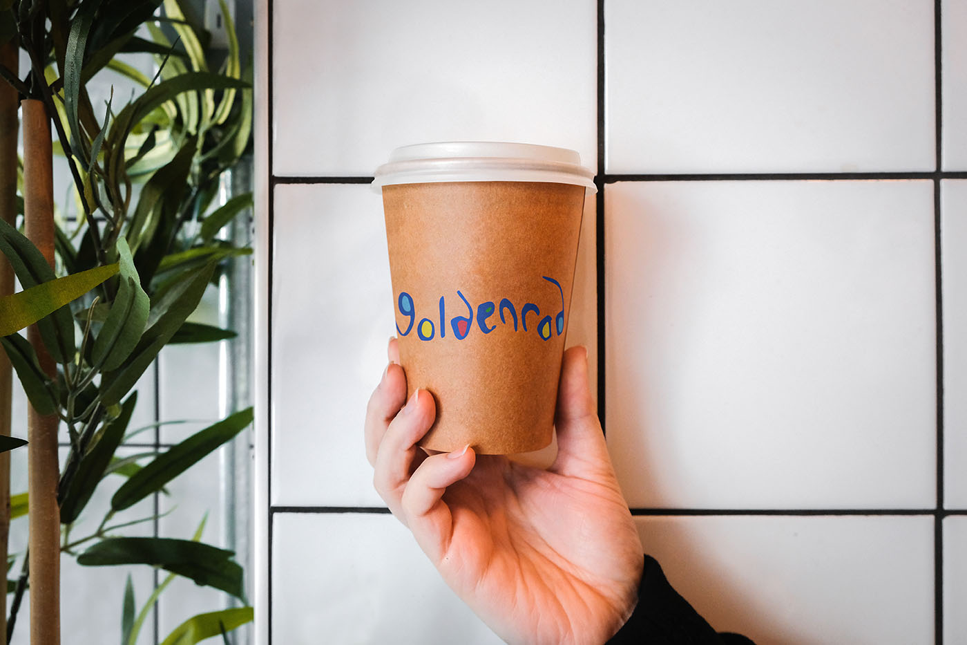
Minimal and bright, elegant but laid-back, warm and inviting yet not quaint. Create a sense of fun, surprise, and playfulness. Family-friendly, but a place Twin Cities folks would want to drive to and hang out.
Audience
Urban dwellers—including families with young kids—who are looking for a weekend drive destination, as well as rural neighbors looking for more dining options.
Inspiration
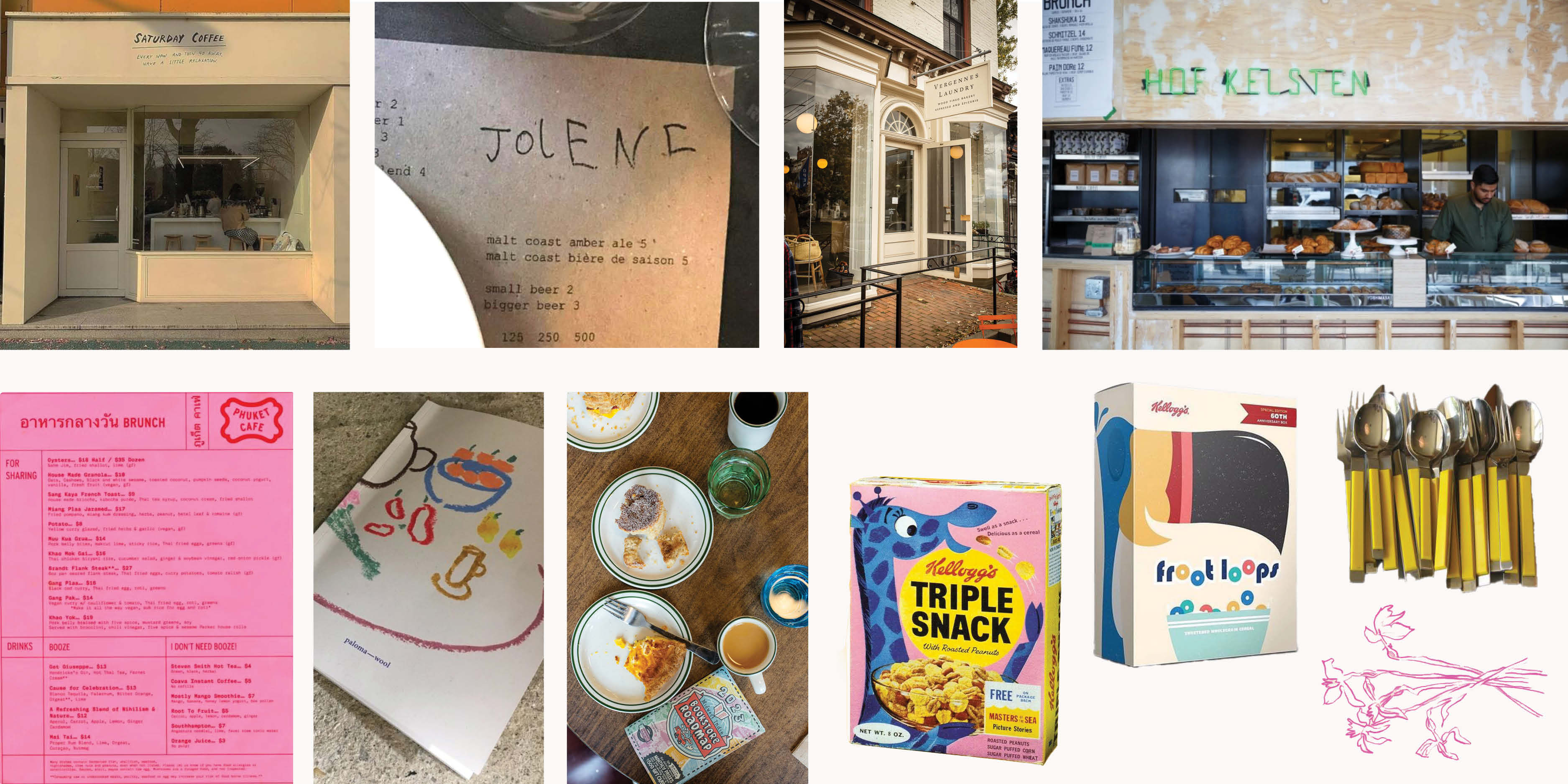
I drew inspiration from elegant, bright diners and bakeries. I wanted to develop a brand that would evoke the sense of childhood delight you get from finding a toy in a cereal box—the same feeling I get when I find a hidden gem in a rural space.
Name & Logo Exploration
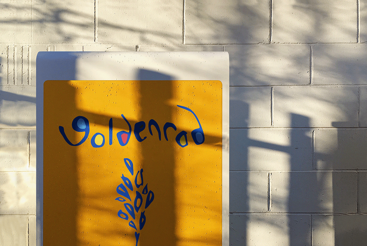
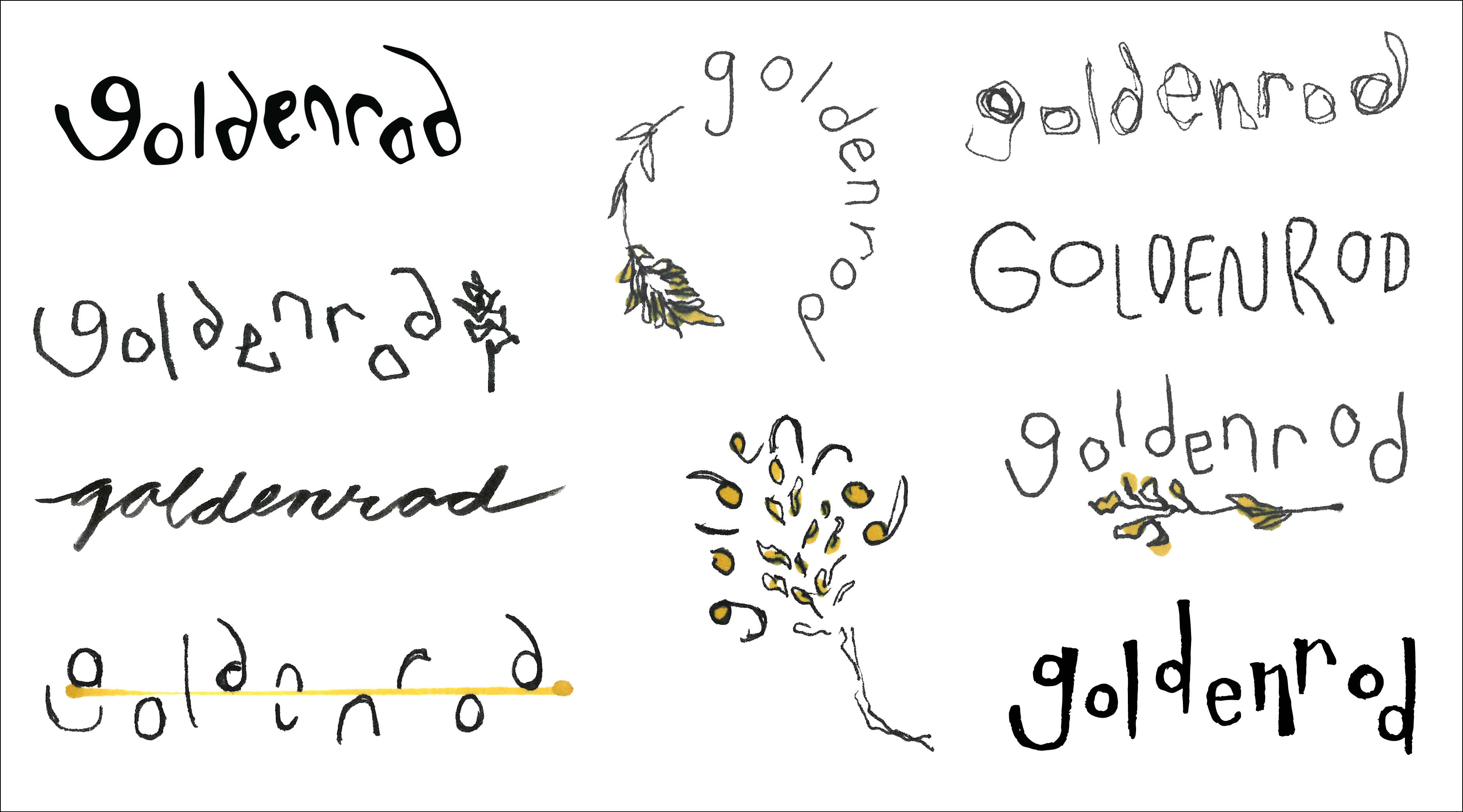
From over a dozen names, I settled on “goldenrod.” The ‘o’s mirrored the shape of the ‘g’ and ‘d’s well, plus, goldenrods dot the ditches of the backroads one would presumably take to get to this diner.
A golden yellow became a primary color to enhance the name, paired with a cornflower blue.
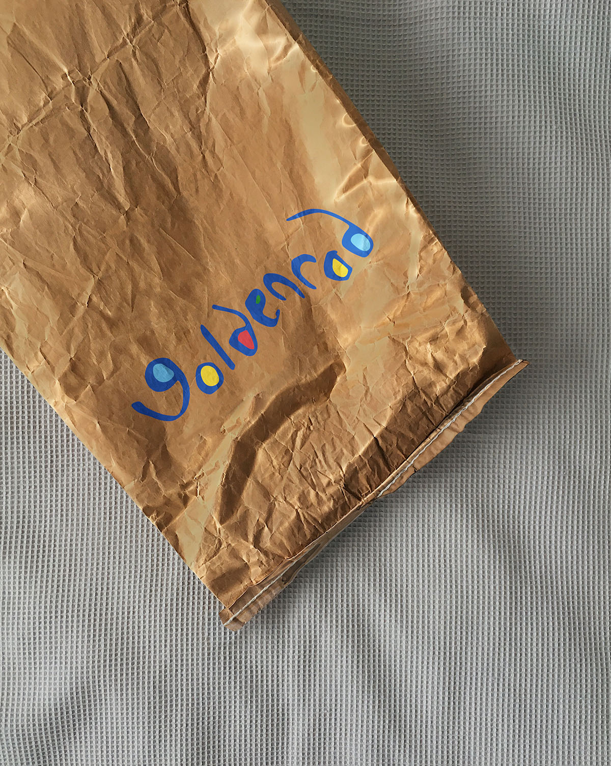
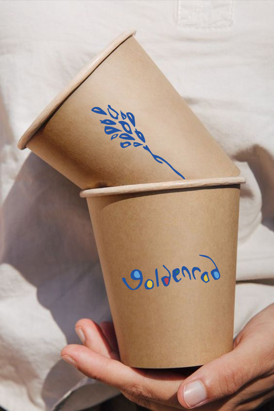
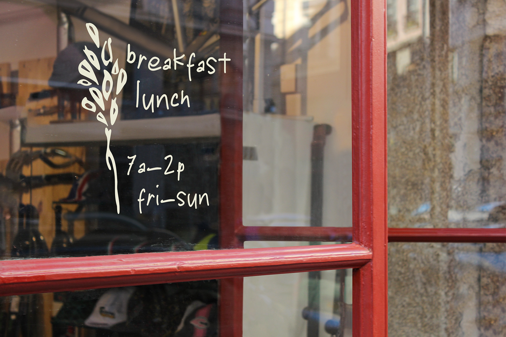
The hand-drawn logo carries a sense of child-like ease, elegance, and playfulness. I explored script vs. lettering, incorporating a flower element and playing with the alignment of type.
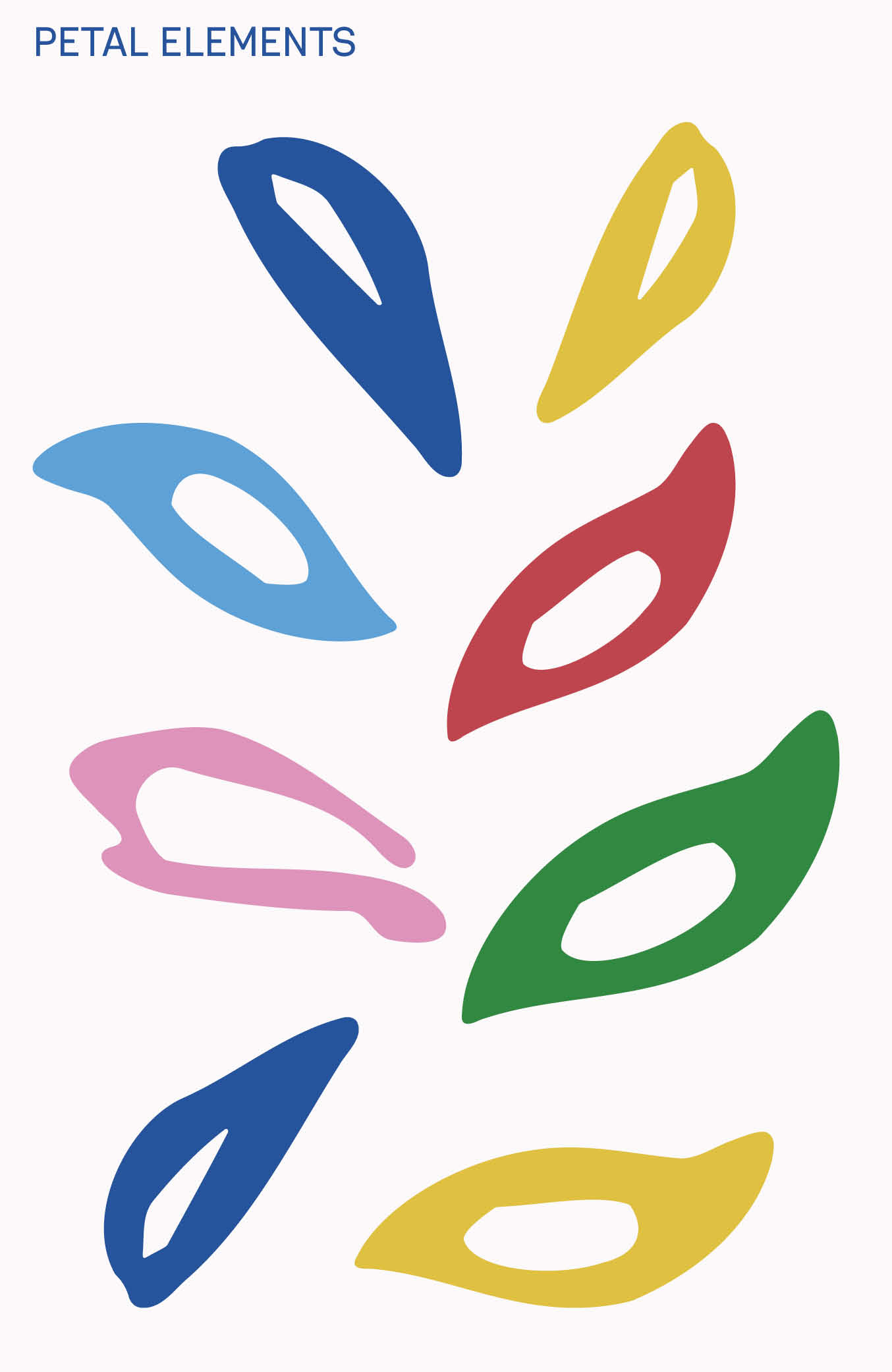
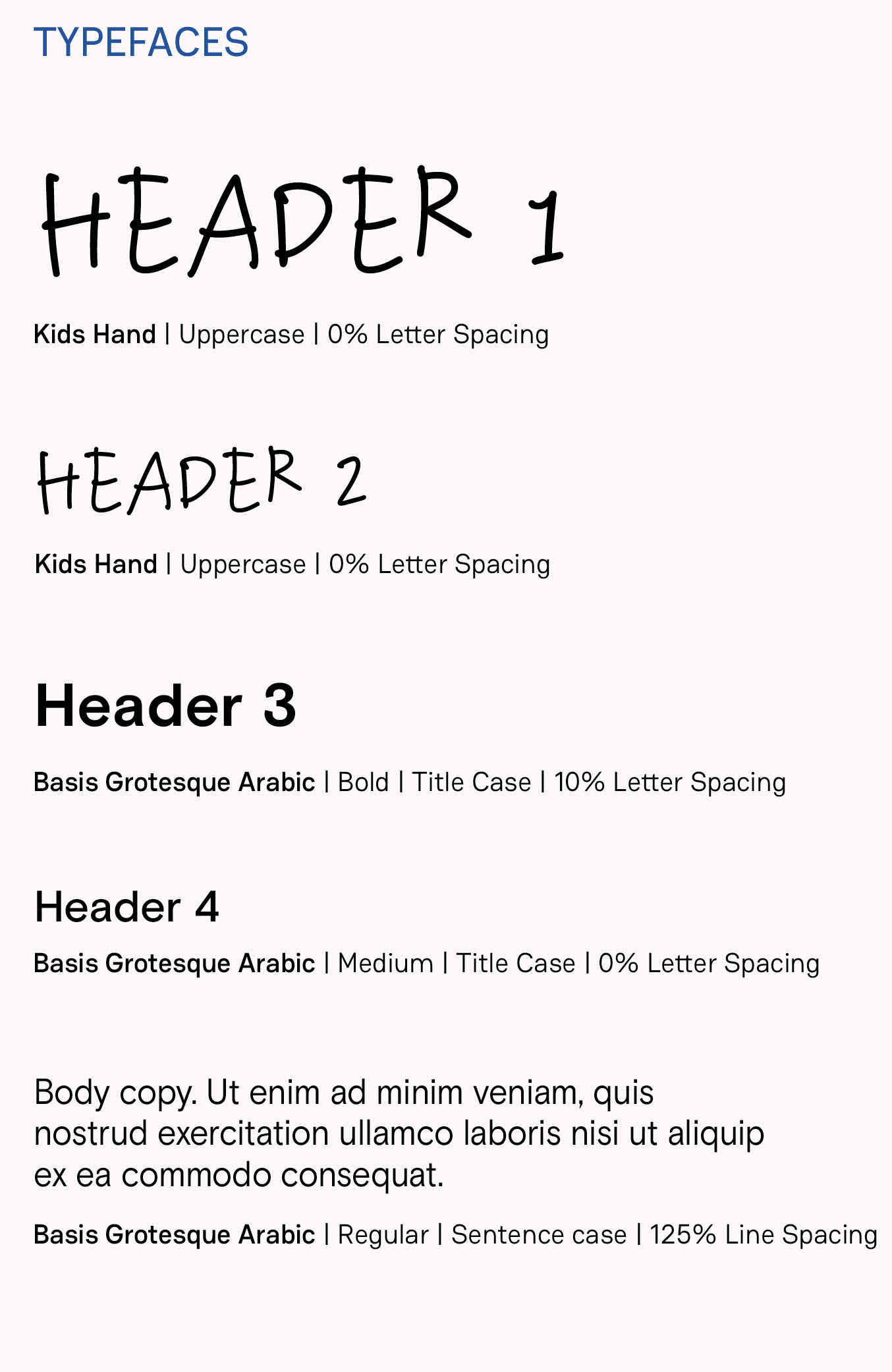
Final Logo, Marks, & Typefaces
Asset Sketches
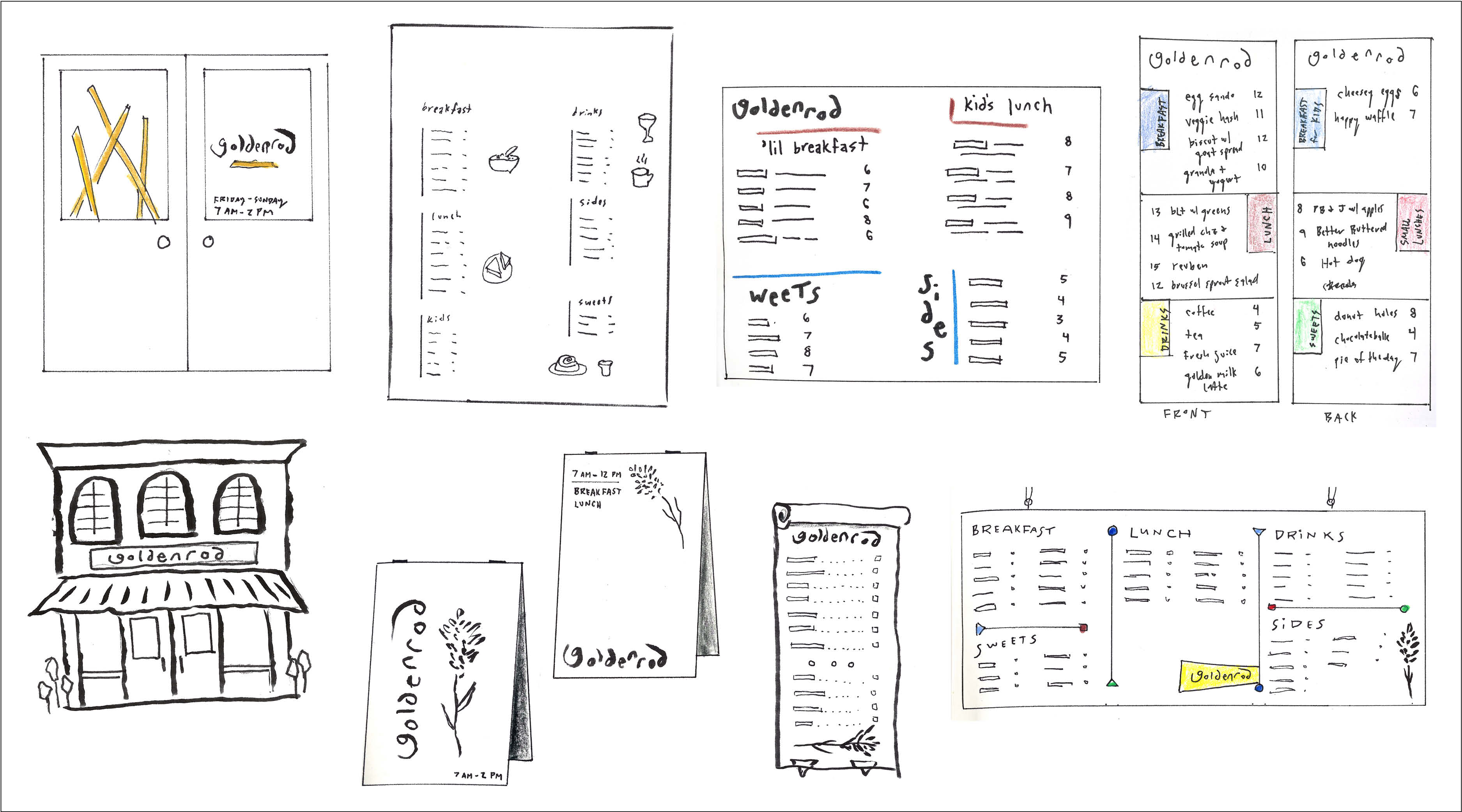
For assets and overall brand, I sketched options along the spectrum of playful and bold to minimal and elegant, settling in the middle.
Color
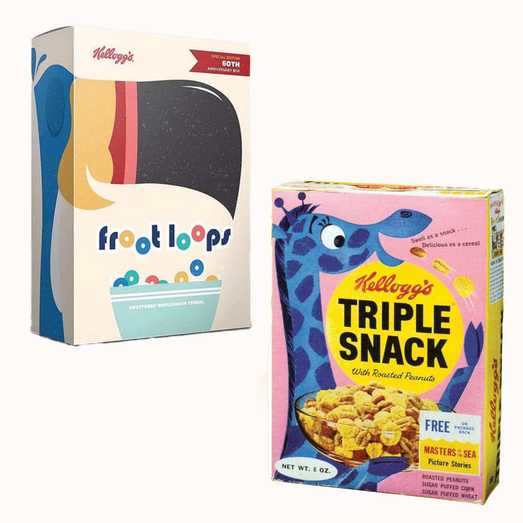
Color inspiration sources
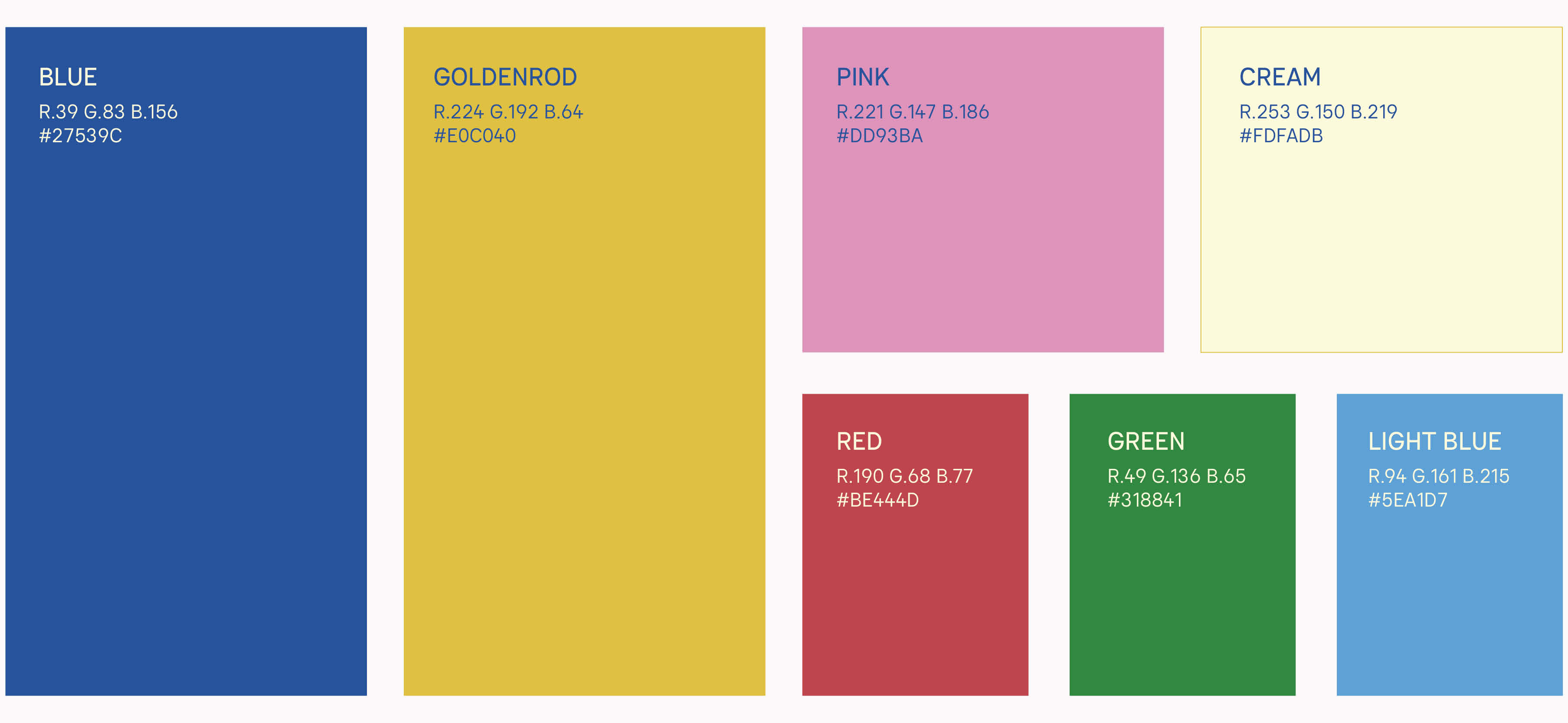
Final color palette