Brand development and visual identity for RIAD Studio, a boutique interior design firm.
Scope
Moodboards, logo and full logo set, color palette, typography, graphical elements, and proofs of concept.
About RIAD Studio
RIAD Studio provides full-service residential design, from layout to finish. RIAD stands for Residential Interior Architectural Design. The name also refers to the traditional Moroccan riad — a home organized around an interior courtyard or garden, a structure reflected in the logo.
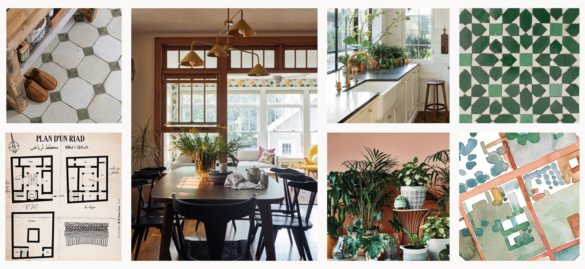
Moodboard
The client provided a range of images, reflecting her interior design practice, materials she is drawn to, and scenes that inspire her. I incorporated her vision and winnowed it down to a cohesive brand approach, rich in texture, warm colors, and geometric patterns.
Color Palette
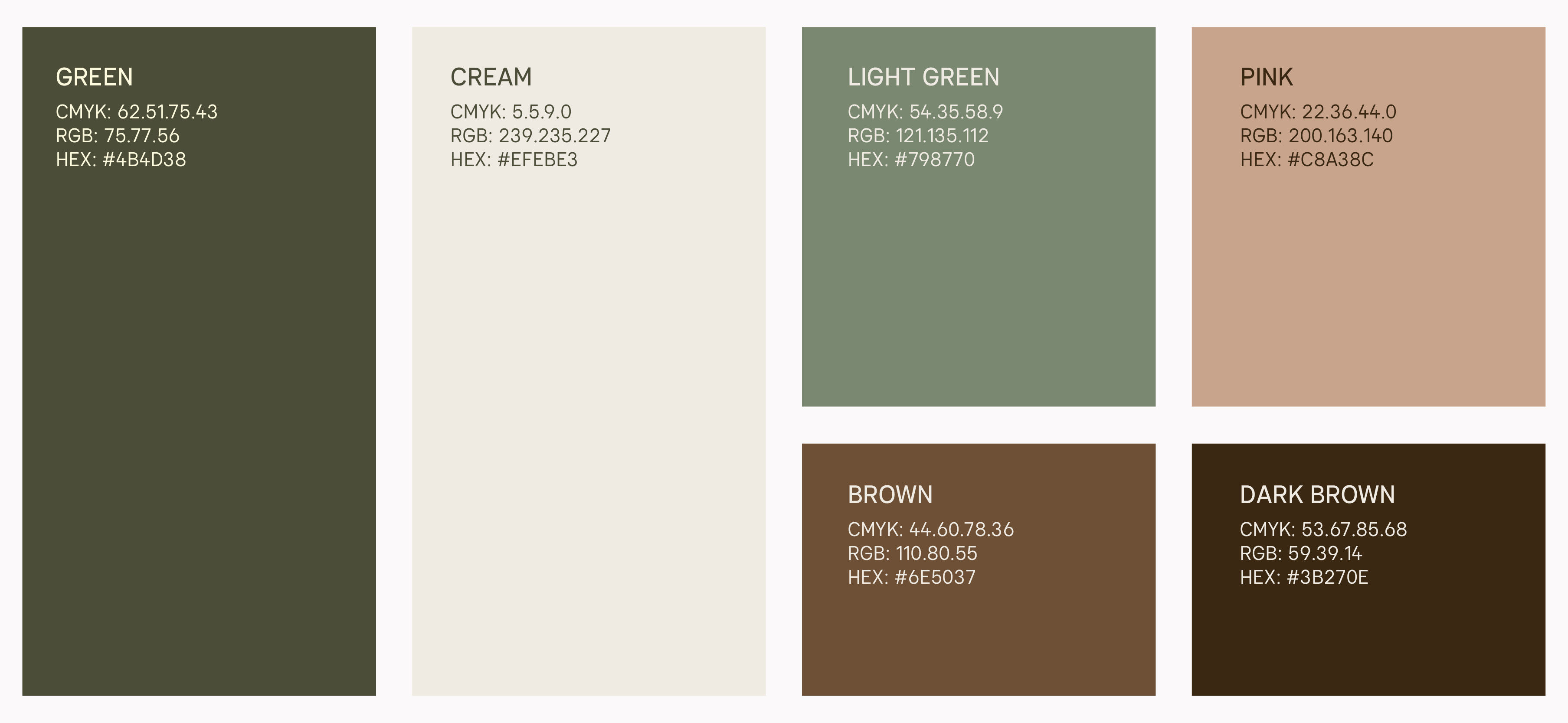
RIAD's color palette draws on natural, neutral-leaning colors, since the colors will largely frame photography of differently styled interiors as the visual focal point of the website and social media.
Primary Logo
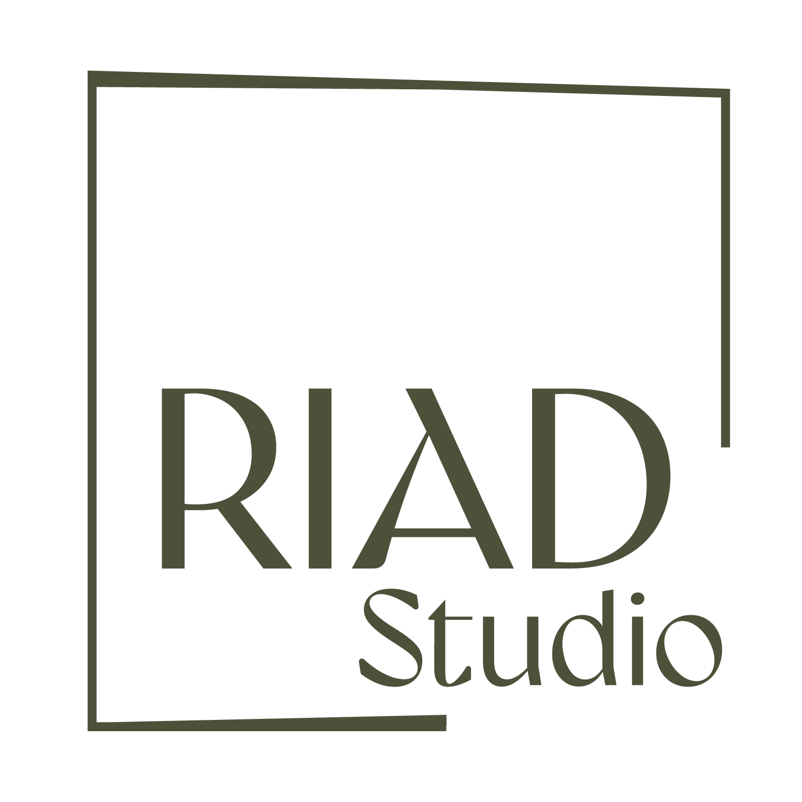
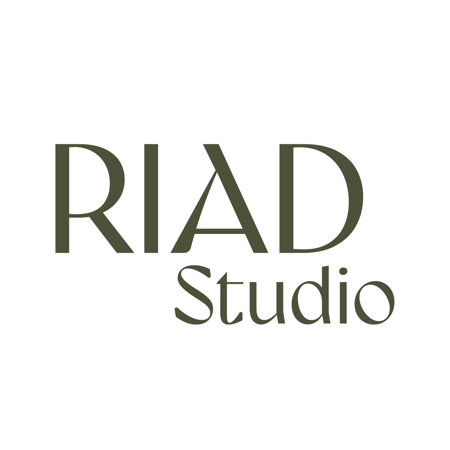
The RIAD Studio logo is derived from the Gyst typeface. The crossbar of the ‘A’ is slightly dropped to open the triangle shape. ‘RIAD’ has visual hierarchy, with ‘RIAD’ and ‘Studio’ paired across all logo types.
The cropped outline with the text occupying the interior is a reference to a riad structure. The opening, with ‘Studio’ coming up to the edge, conveys RIAD Studio’s willingness to push and reconsider existing boundaries.
The slightly angular and asymmetrical line weight mirrors the high contrast of the type, and gives a sense of surprise while feeling bespoke — the type of unique attention RIAD Studio brings to its work and spaces.
Secondary Logomarks
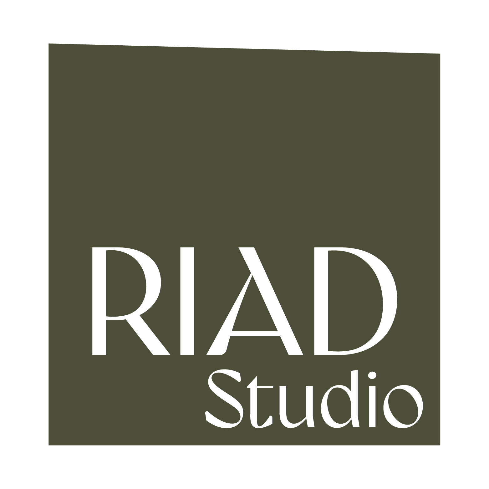
The stacked text-only logo should be used when space is limited.
The initials-only logo should be used sparingly and where RIAD Studio’s brand is otherwise very apparent, such as a social media icon or a website favicon.

Typefaces
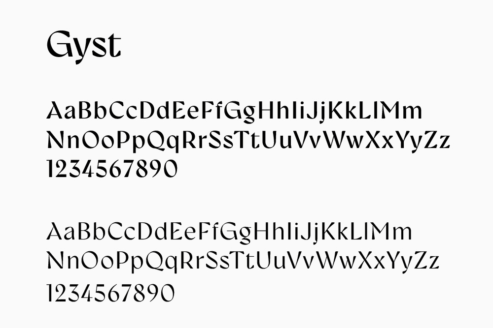
Gyst is a neo-humanist typeface that spans the arc from a modern humanistic sans serif to a captivating cursive serif. Gyst is the base type for RIAD's logo and is used sparingly for headers and sub-heads. Designer: Roland Hörmann
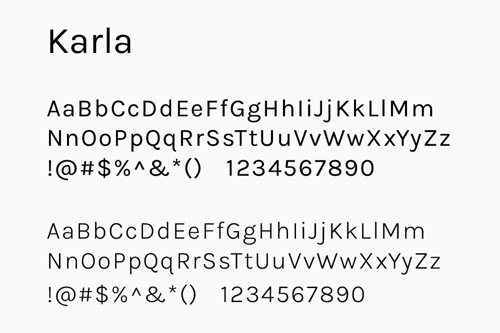
Karla is a grotesque sans serif family, a touch quirky, designed by Johnny Pinhorn. It's a legible font used for body and web copy.
Graphic Elements
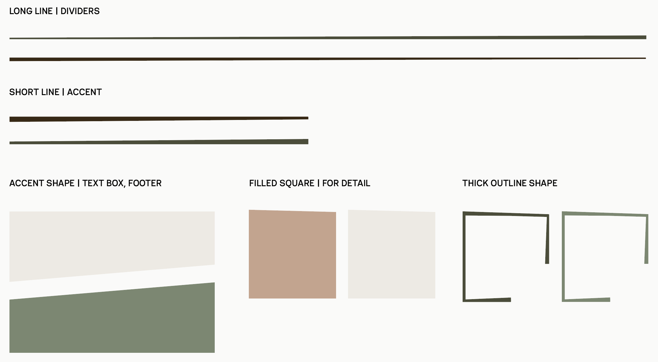
These accent shapes can be used at different scales and in different colors. They are intended to provide subtle reinforcements of the brand identity. They all incorporate the slight asymmetry of the primary logo.
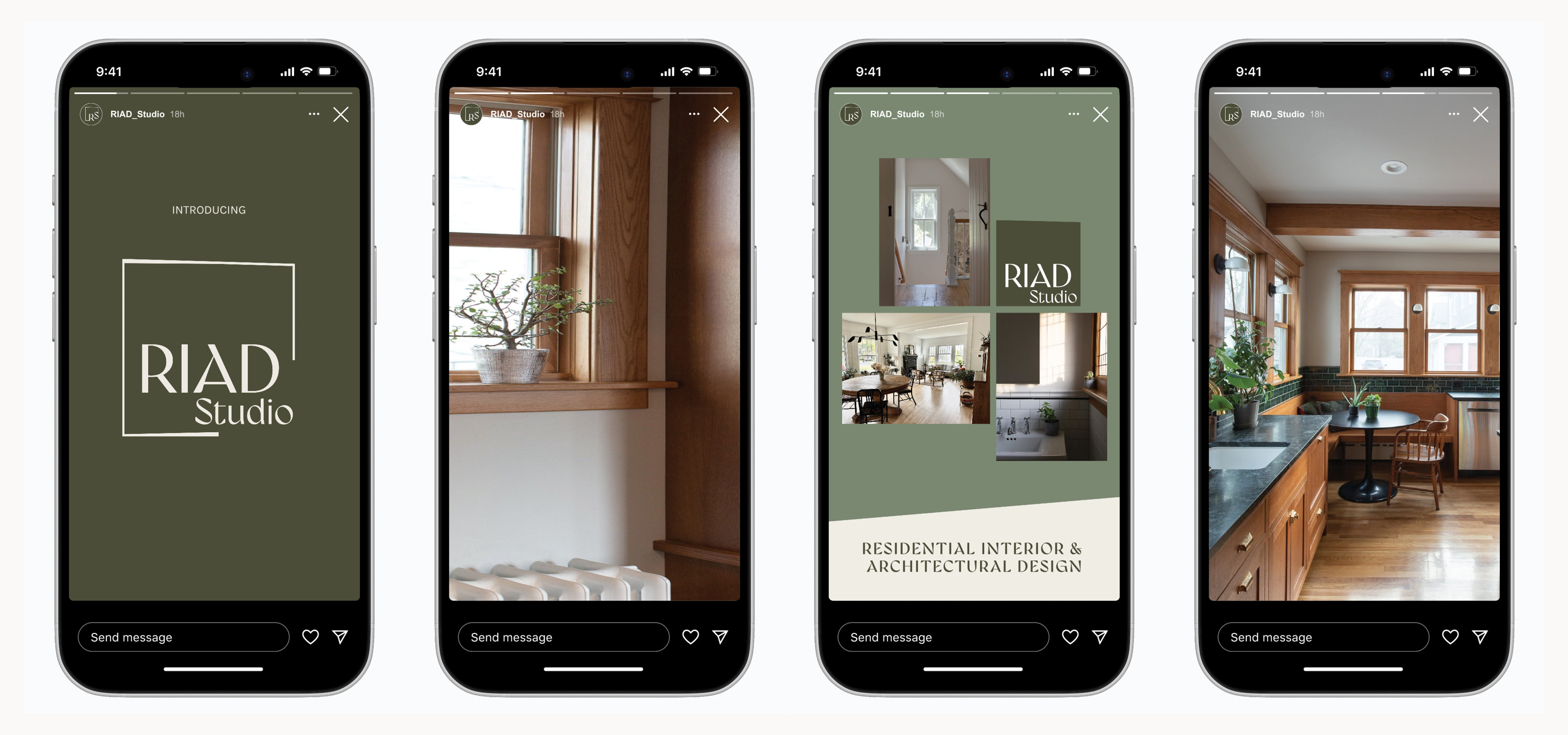
Brand Elements: Instagram Story Panels
While Instagram is primarily used for showcasing process and finished projects, brand elements can be incorporated into Instagram panels for announcements, CTAs, etc.
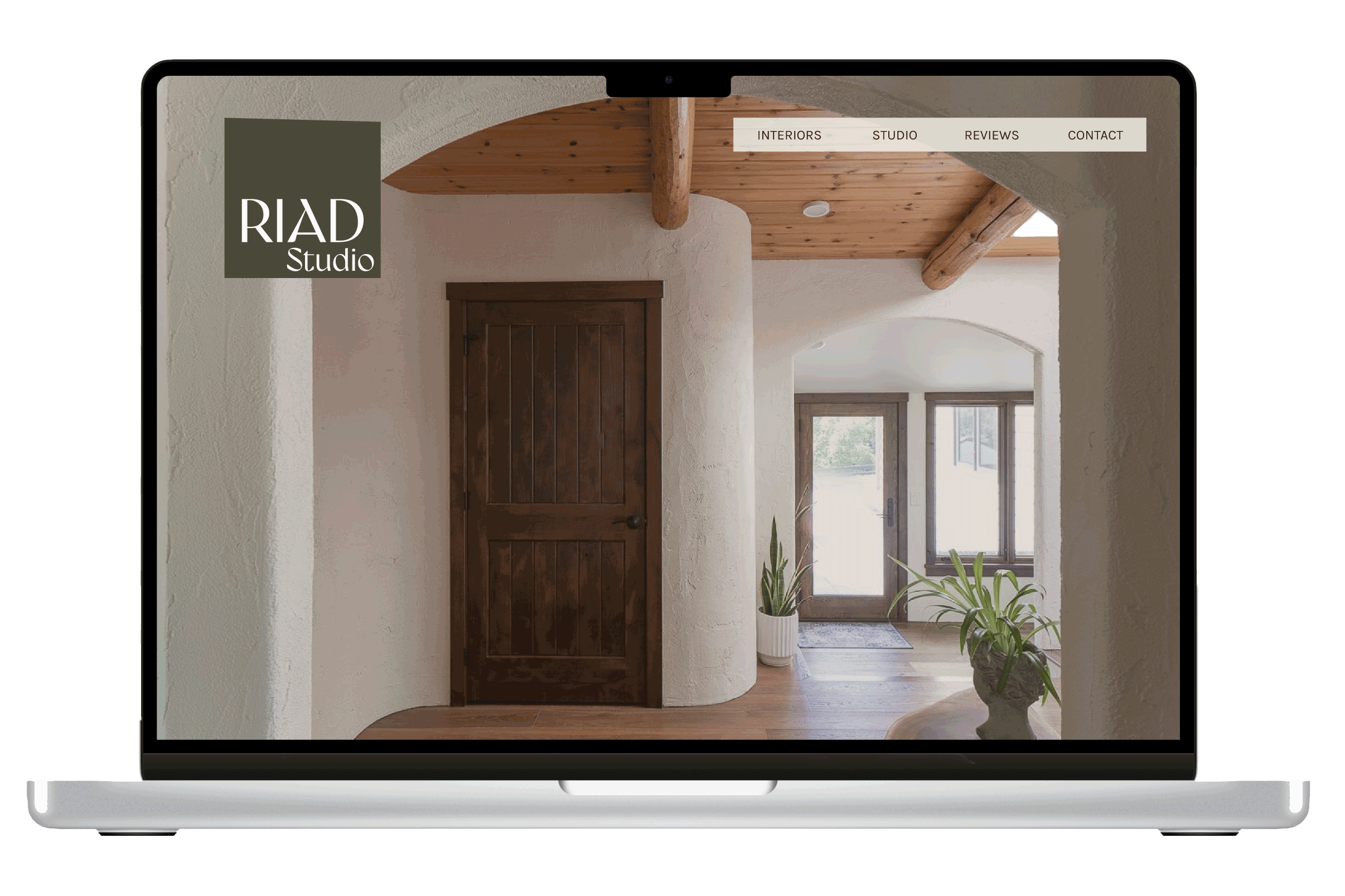
Website Mockup
The partial Figma mockup below shows how these brand elements can be applied to the RIAD Studio website. The website will primarily showcase RIAD Studio work, so the brand is designed to let imagery be the main focal point.