Rural Design Studio
Brand Development | Web DesignA design studio of and for rural communities.
Deliverables
Research, brand development, visual identity system, and website design.
About Rural Design Studio
The Rural Design Studio collaborates with community partners and a network of fellow creatives to provide accessible, place-based design to rural people, places, initiatives, and businesses.
What problem was I trying to solve?
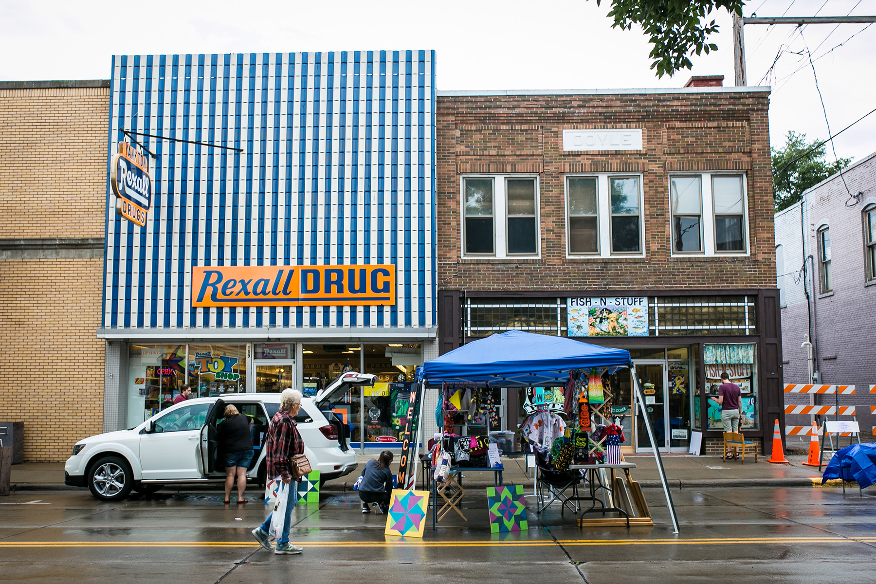
Rural places are filled with creative people. Yet there is lack of resources — both people and money — for contemporary graphic design, web design, and branding services in rural communities.
Rural doers, makers, and innovators deserve creative design partners who can help elevate the third spaces they’re creating, the businesses they’re launching, the policies they’re advocating for, and the plans they’re making for continued vitality.
They need an agency on the inside.
Why is this important to me?
I grew up in a rural community, live in one today, and seek out rural places when I travel. I've seen firsthand that creativity isn't limited by geography—but access to design services (and resources for professional design) often is.
I want to help close that gap by bringing thoughtful branding, web design, and placemaking strategies to rural communities while also creating more onramps into design careers and a shared recognition of the role design can play in strengthening local businesses and communities.
Key Observations Driving This Work
DIY Design
I love and understand the scrappy nature of small business owners and nonprofit marketers, especially in rural places. But I want the hair stylist, the local florist, the new bakery, the community foundation, the mechanic not to have to be their own in-house graphic and web designer, too.
Design Dollars Going to Urban Agencies
The brands I noticed were doing a great job with their branding, web presence, and social media were more often than not working with a creative or agency partner in the Twin Cities. I want to keep rural design dollars local, at least to another rural community, when possible.
ROI of Branding is Undervalued
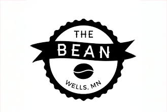
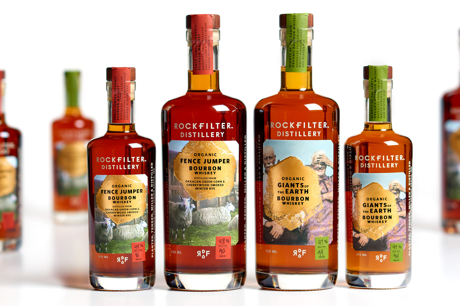
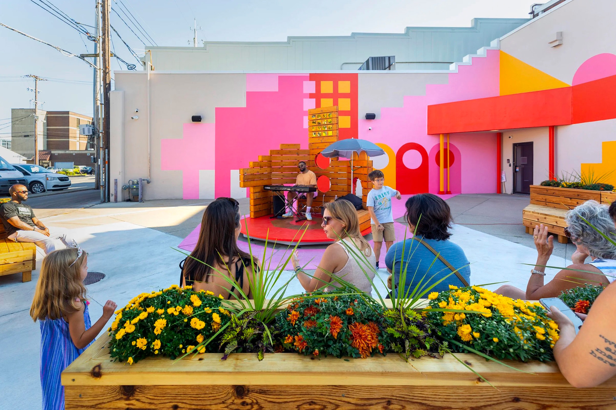
While brand and marketing investments can seem like "nice to have" assets, I’ve witnessed the rise in rural destinations largely due to their brand presence, from cool distilleries to cozy cafes to stunning remote retreats. I want rural businesses and entrepreneurs interested in growing their reach to have a local partner.
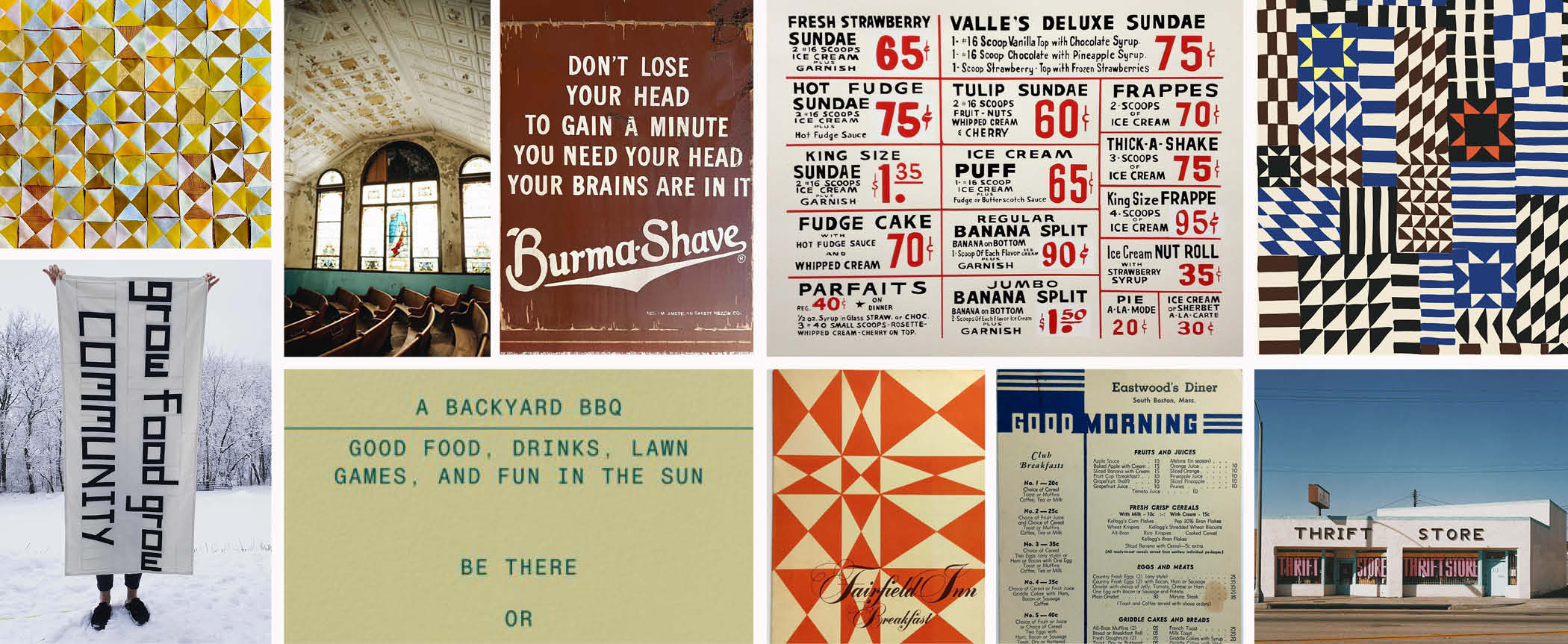
Moodboard
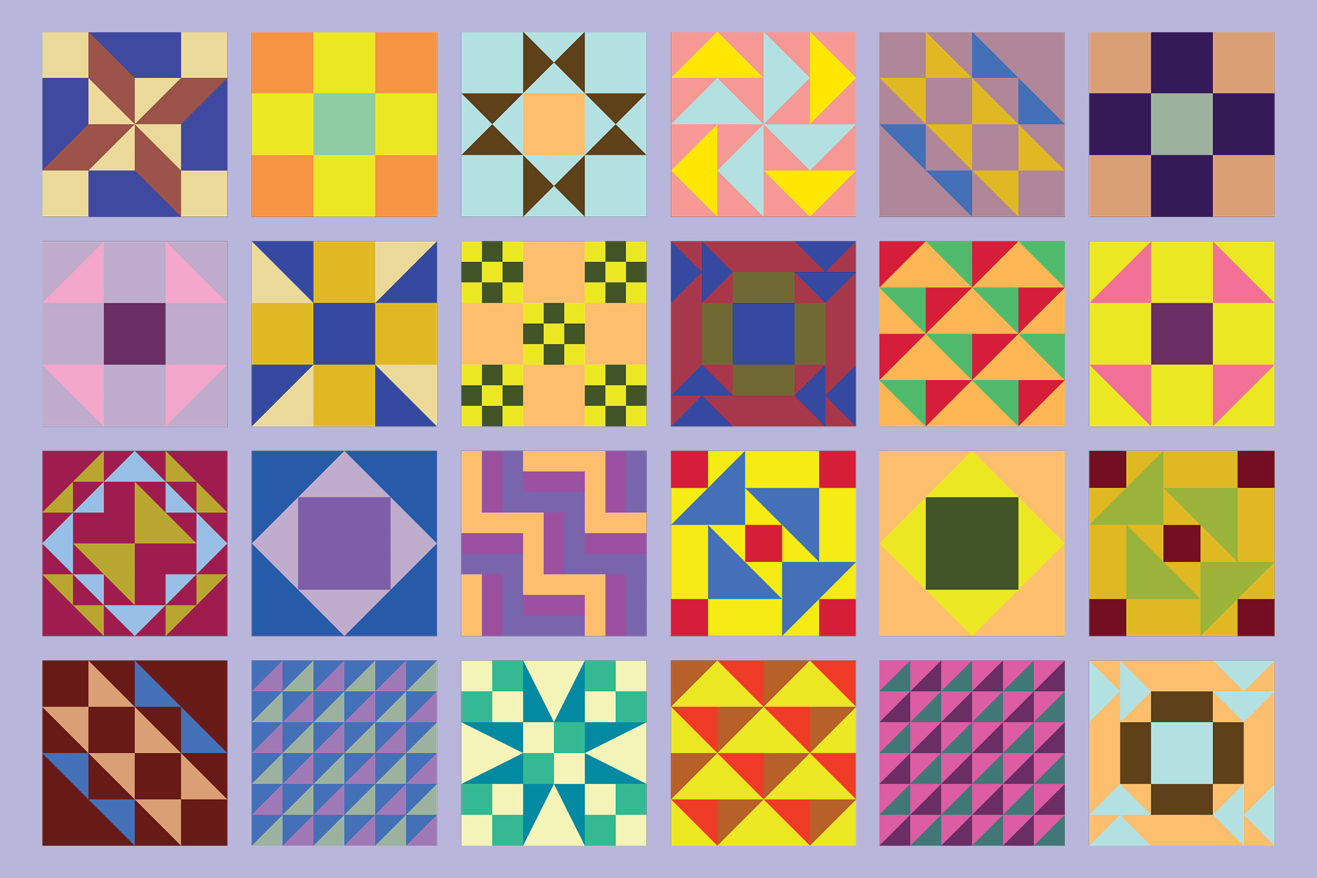
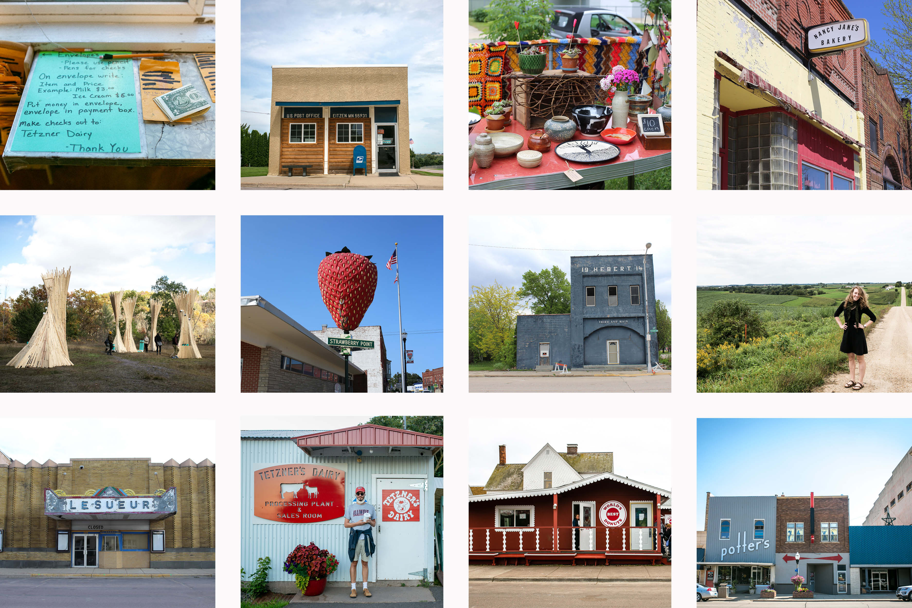
Hand-painted signs, geometric patchwork quilts, weathered and loved textures, diner menus, and bold yet natural colors helped inspire the brand visuals.
Studio Clients & Collaborators
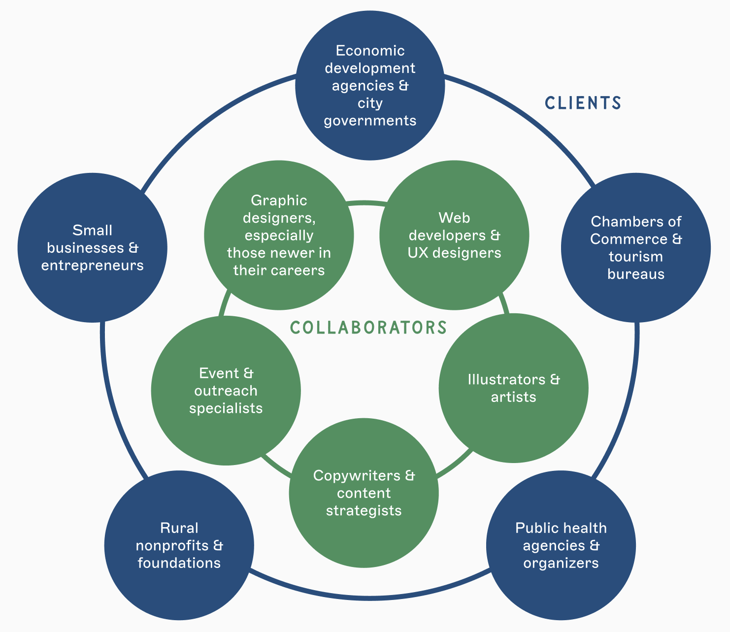
Clients could include rural small businesses, nonprofits, foundations, community organizers, economic developers, and tourism agencies.
Studio collaborators would be graphic and web designers, marketing strategists, artists, illustrators, photographers, event professionals, and copywriters.
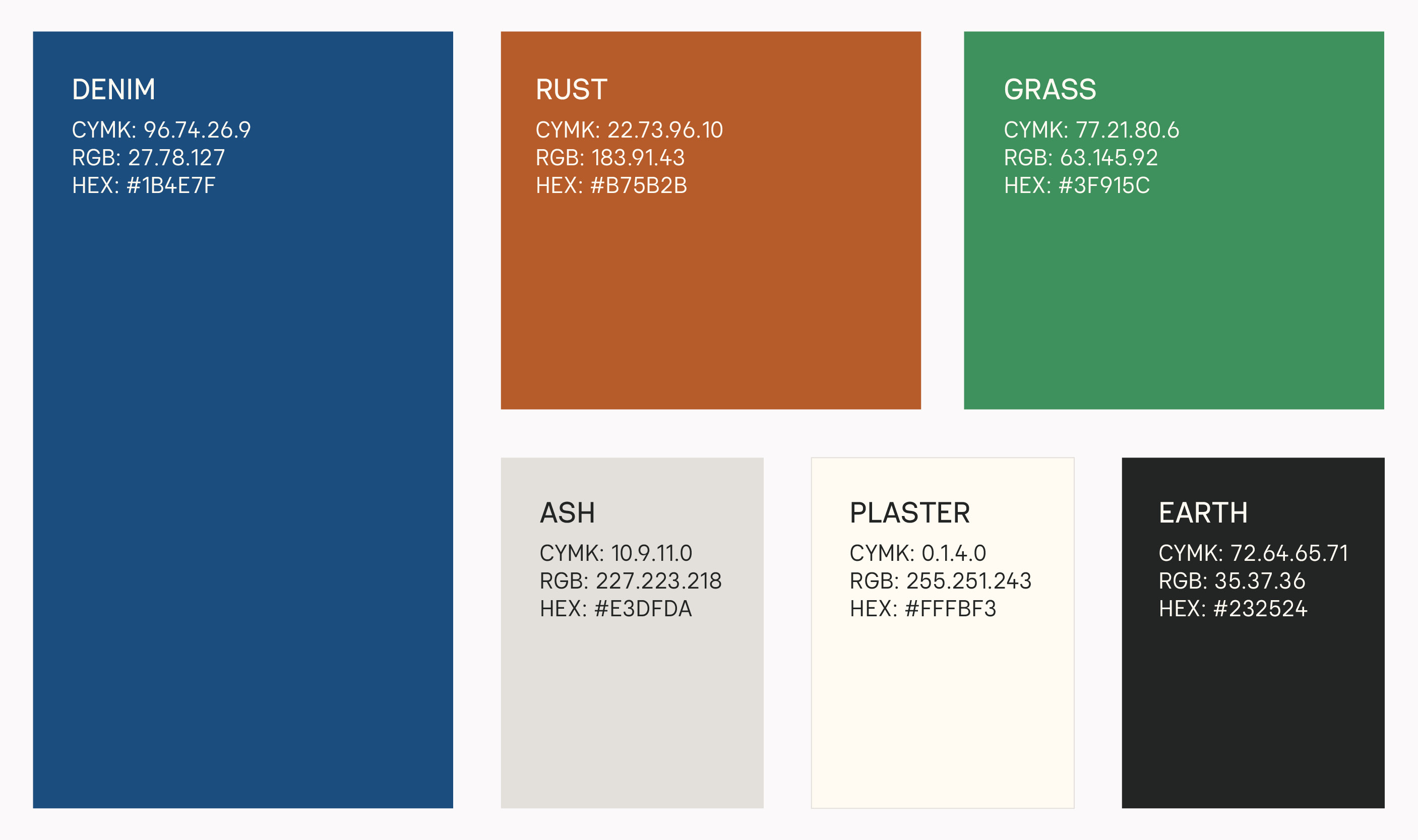
Color Palette
Drawing from natural materials, worn-in fabrics, and nostalgic neutrals, this subdued, complementary palette could be toned up or toned down based on the use case.
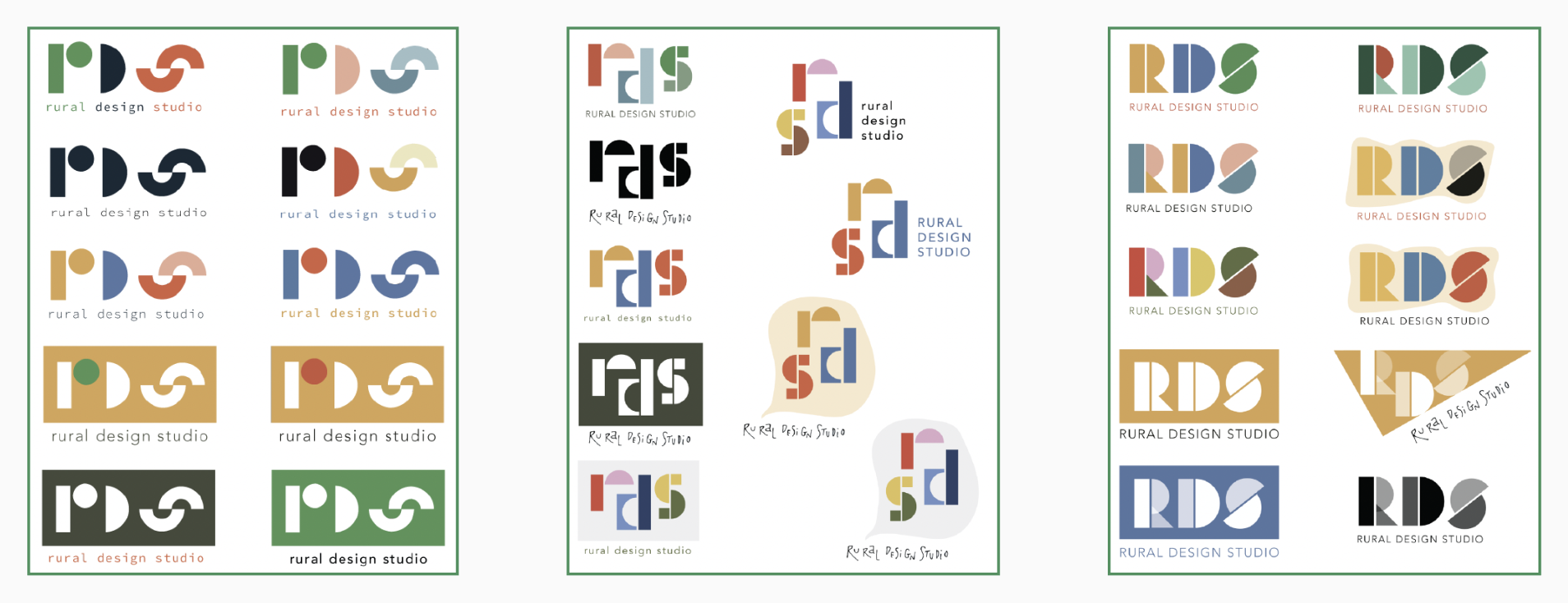
Early Logo Sketches
I started sketches for the Rural Design Studio a couple of years ago. Upon revisiting these logos, they felt too geometric, bold, and quirky. They didn't align with the visual language I was hoping to achieve: warm, professional, approachable, while still contemporary.
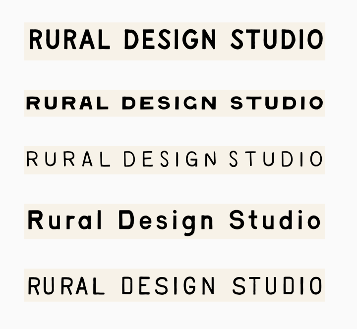
Logo Development
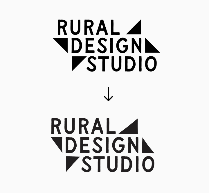
I decided to switch to a text-based logo, while still incorporating a more minimal geometric quilt block shape. I explored several fonts by Taylor Penton, all hand-drawn that fit the bespoke, vernacular aesthetic. User feedback helped me select Flapjack as the primary typeface.
The last phase of iteration was getting the triangle shapes more asymmetrical, similar to the imperfect edges of the letters.
Primary Logo
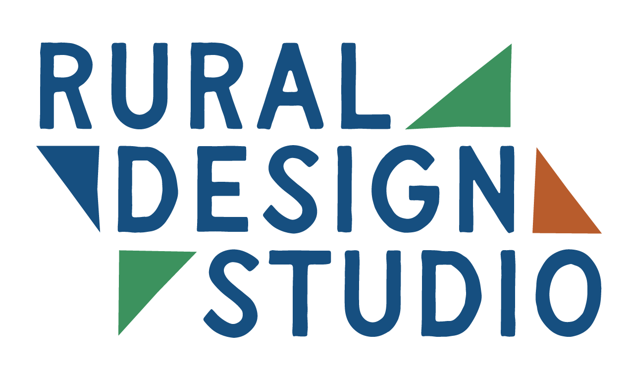
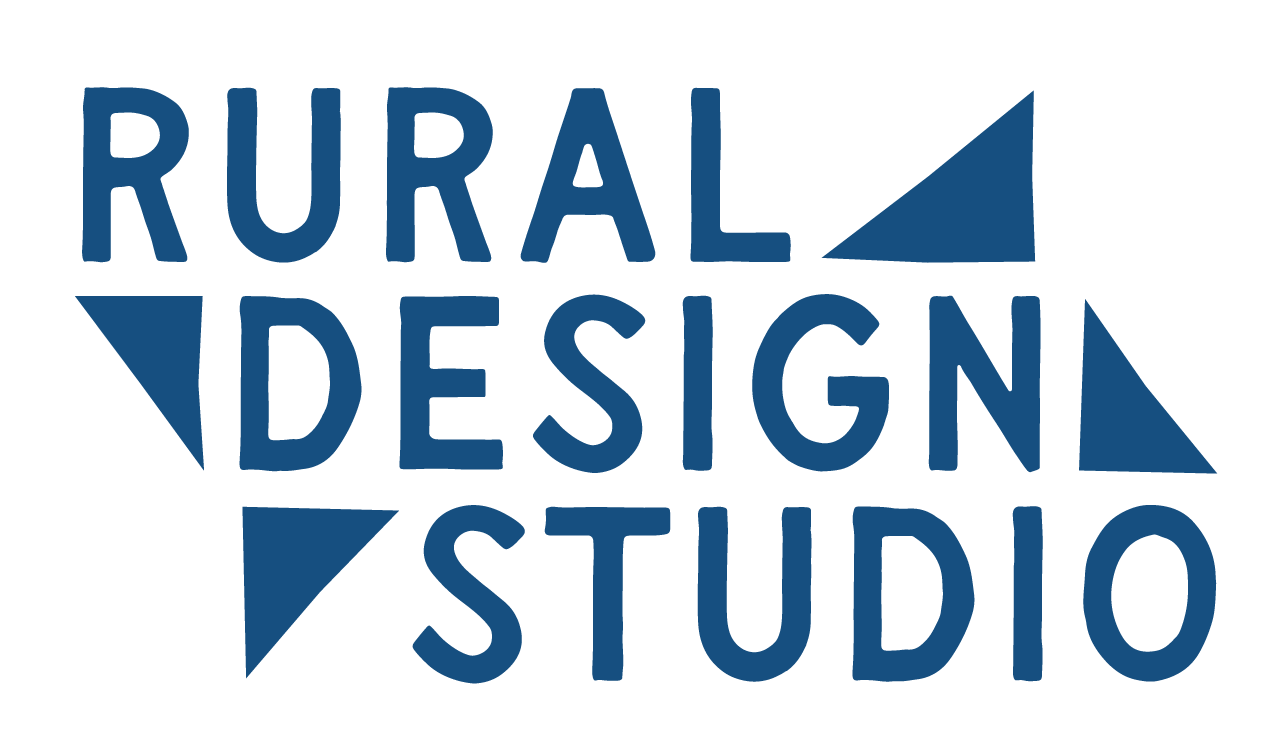
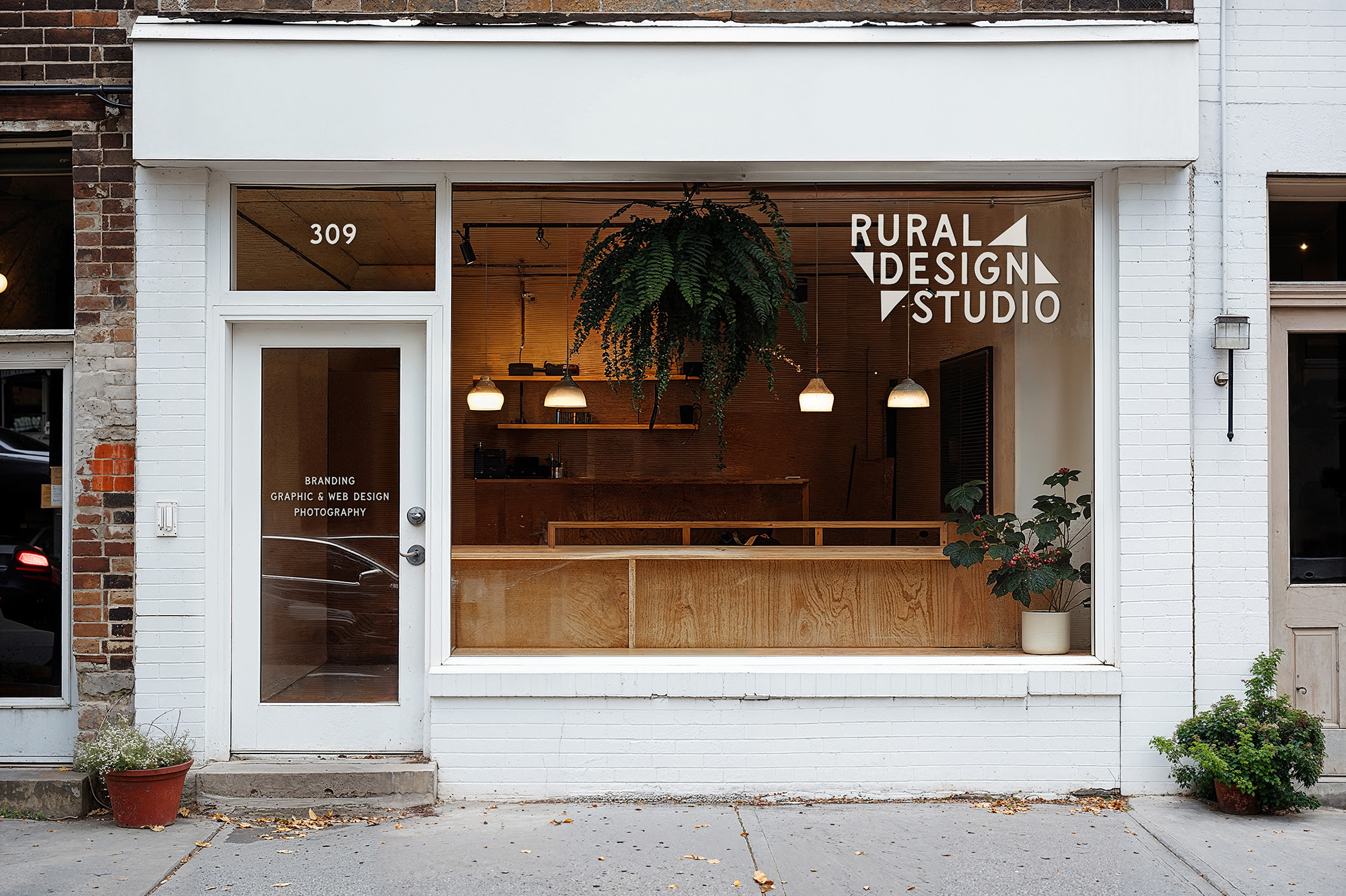
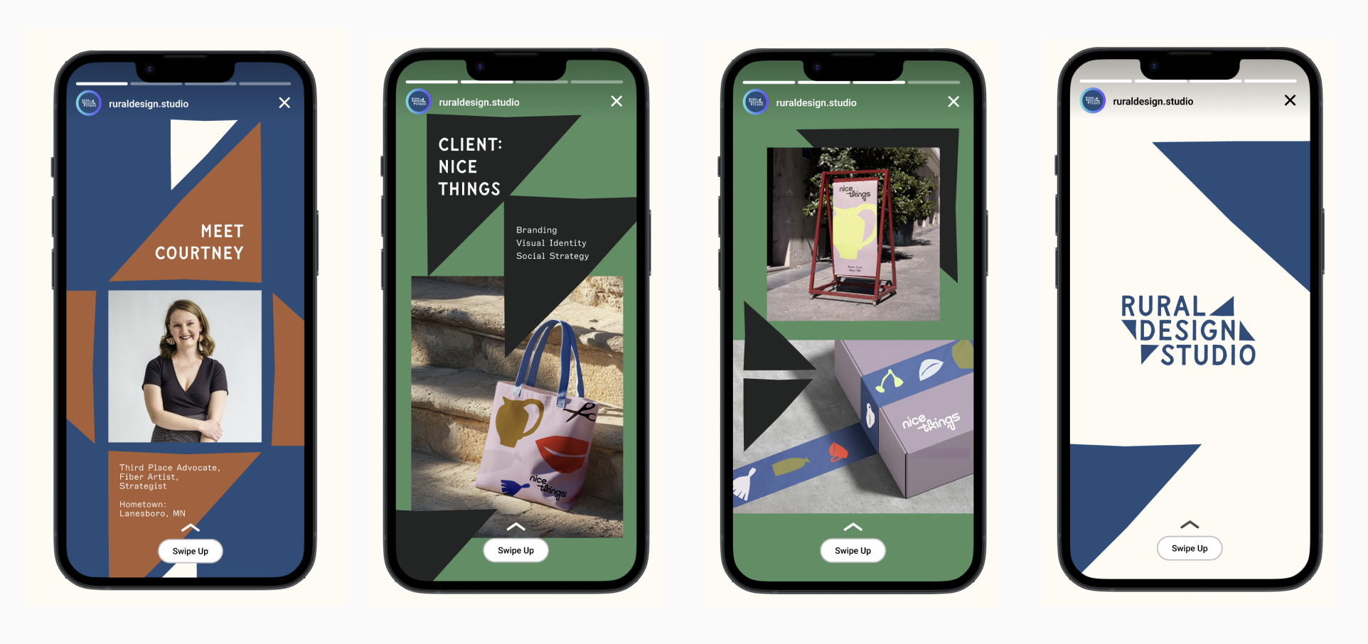
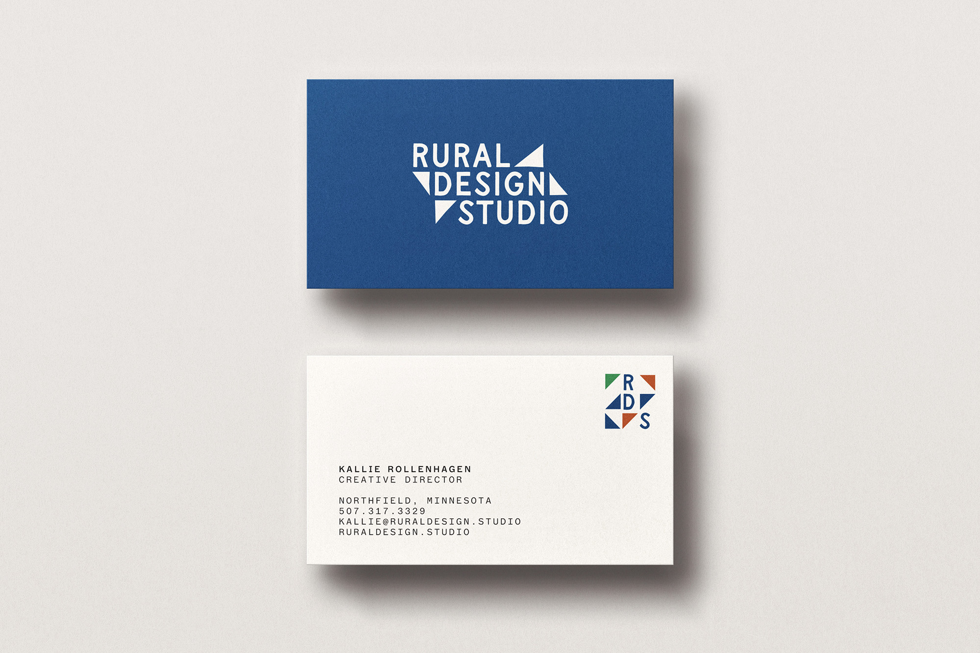
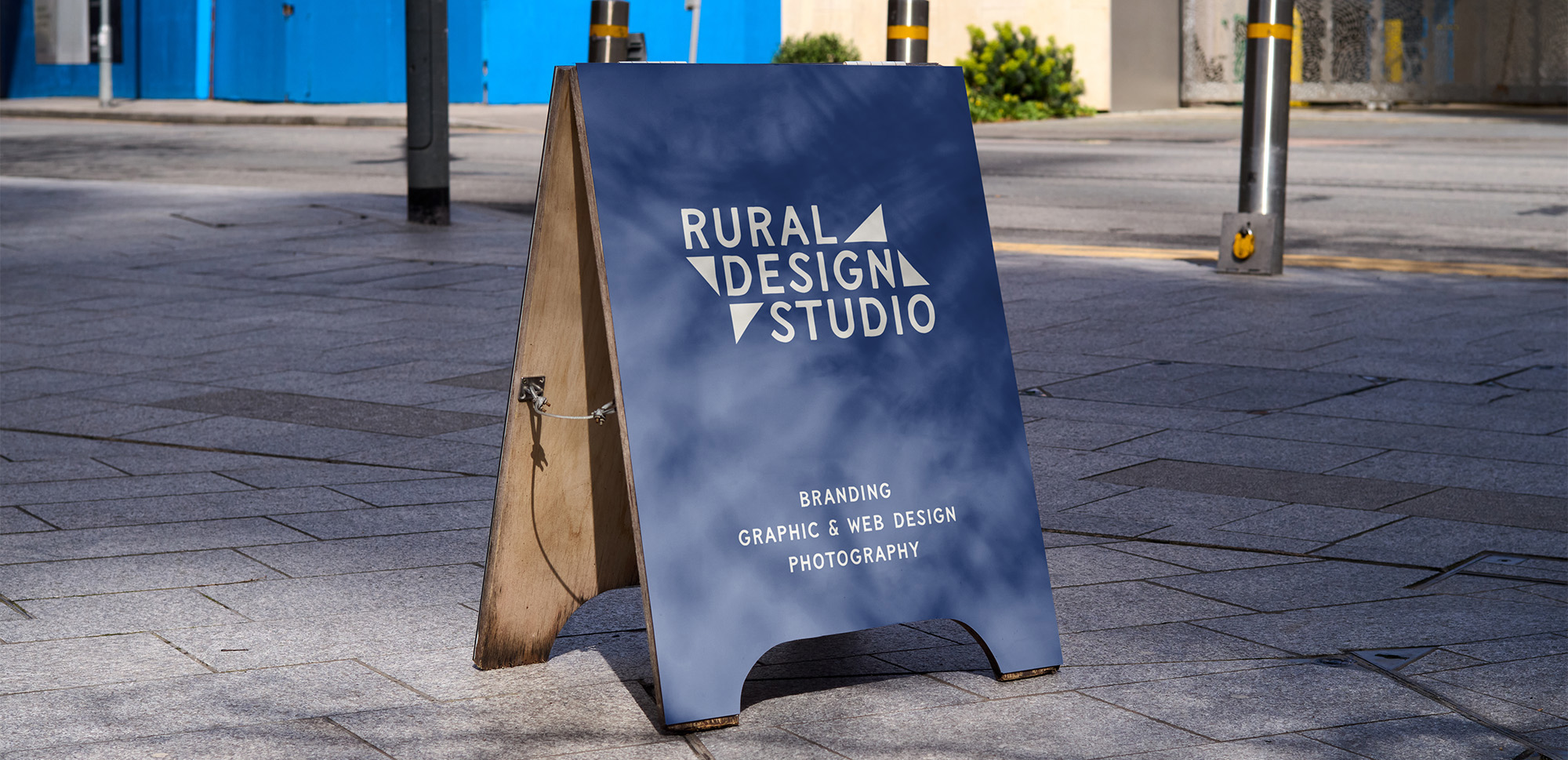
To create the bespoke, vernacular, and bold aesthetic I wanted, I used the hand-drawn typeface Flapjack, by Taylor Penton, a font inspired by old shop signs and billboards.
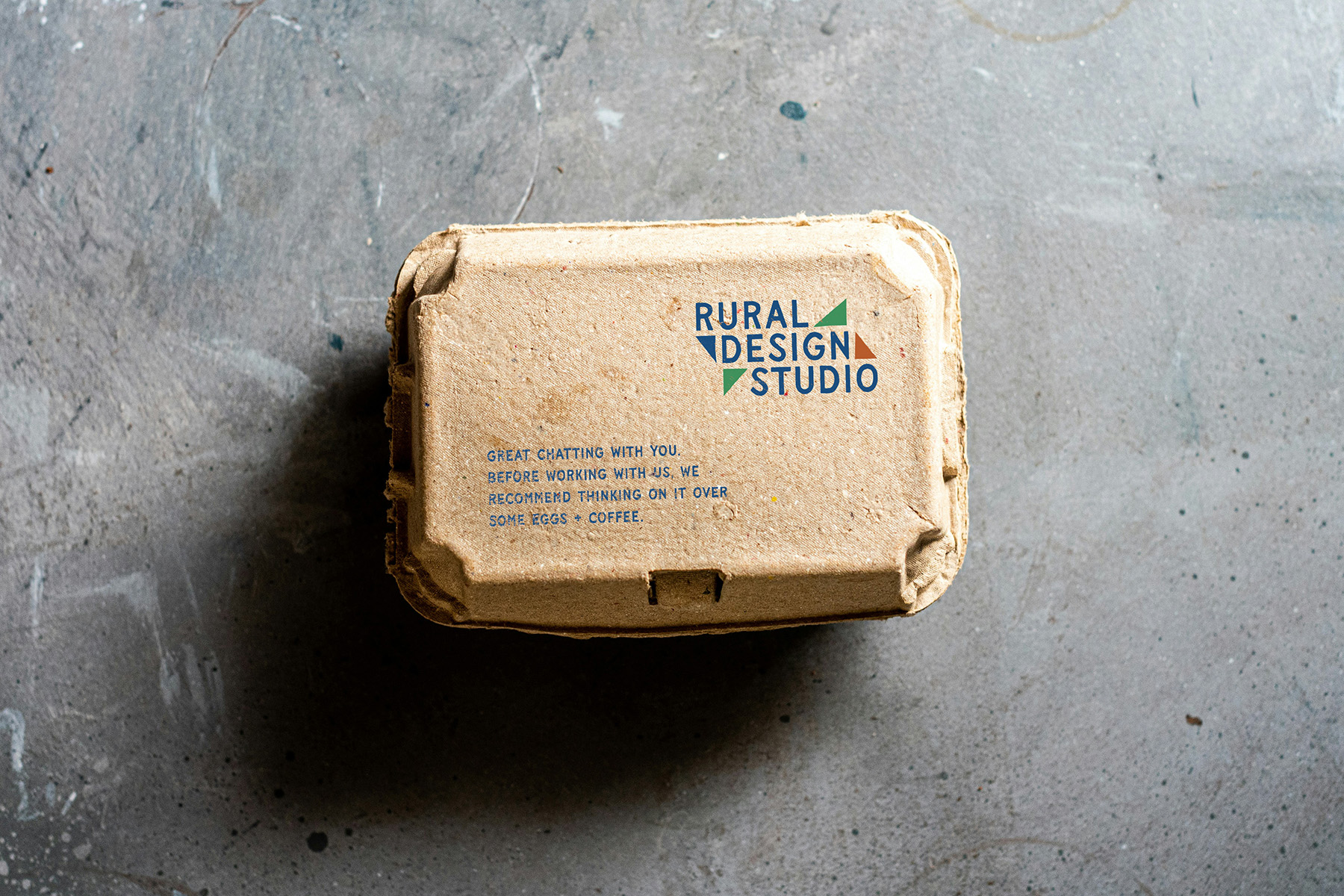
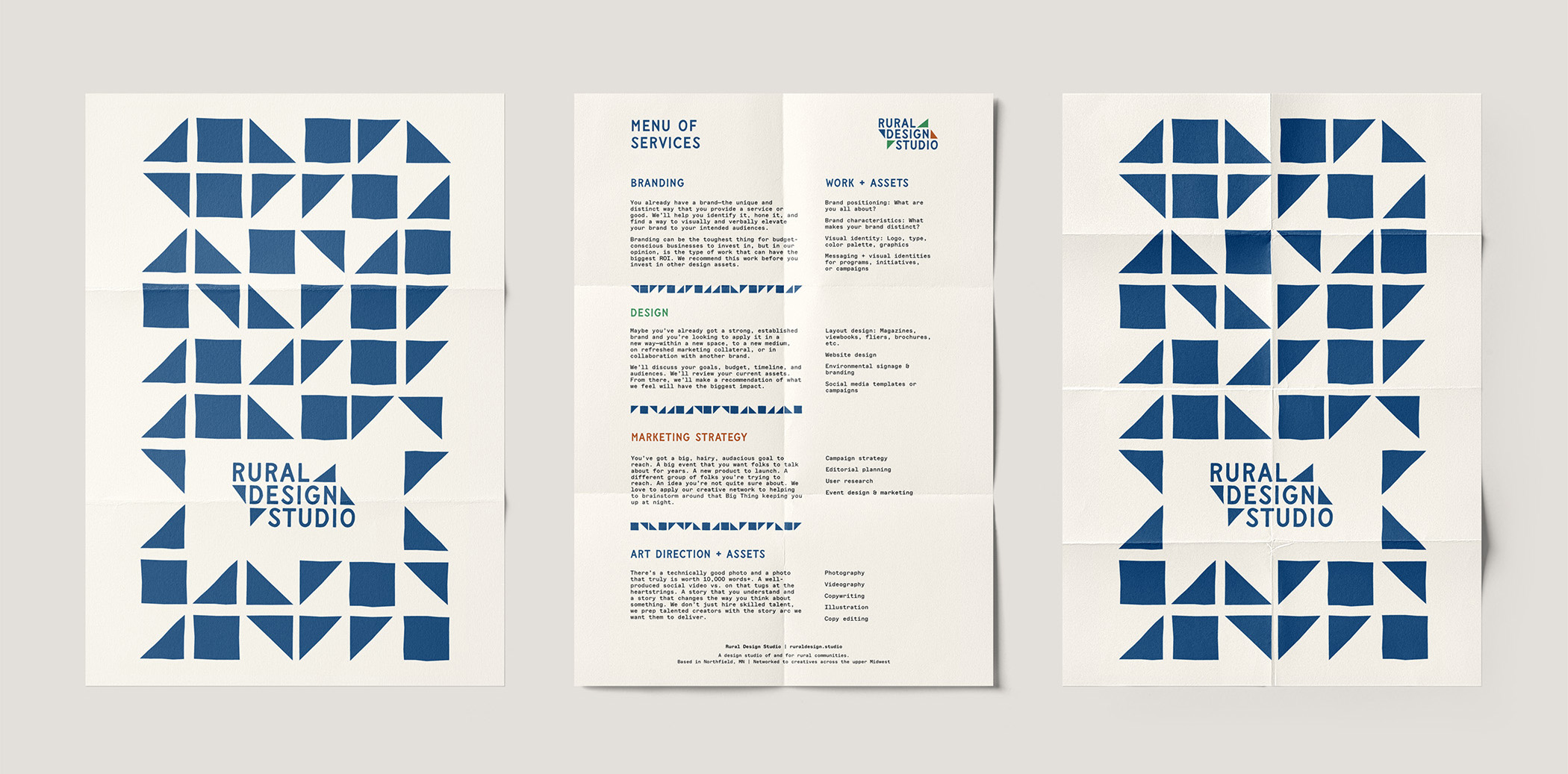
I also incorporated triangles, each a bit asymmetrical and imperfect, to nod toward the pieced-together nature of quilts and the handmade quality of many vernacular signs.
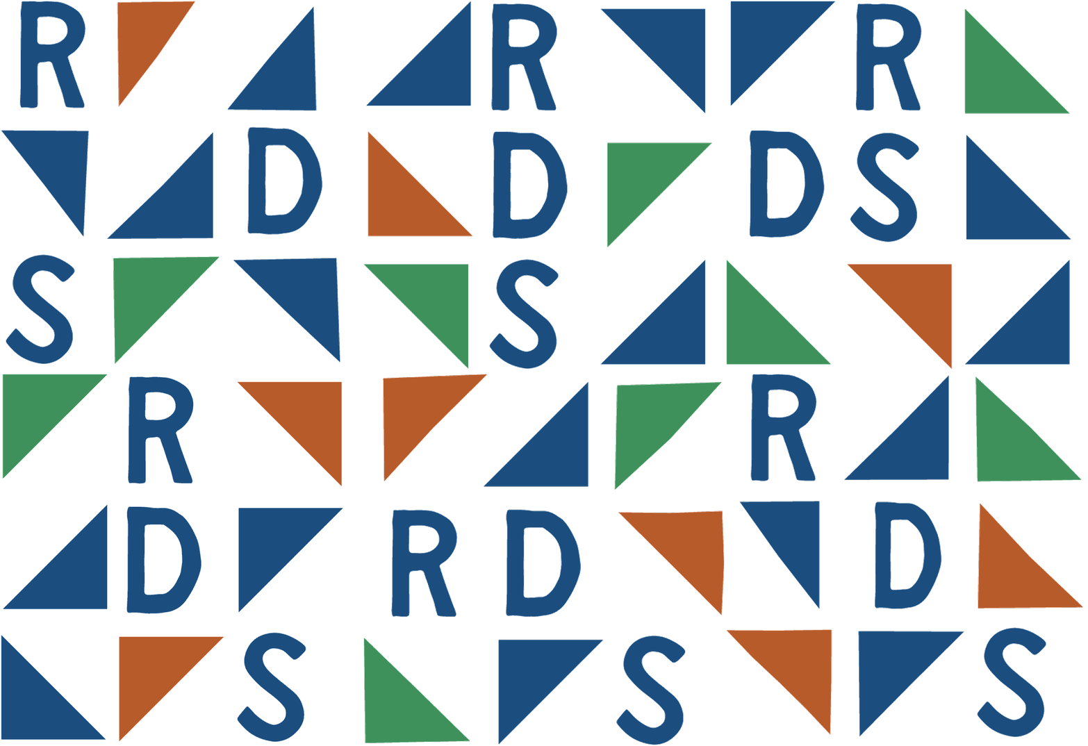
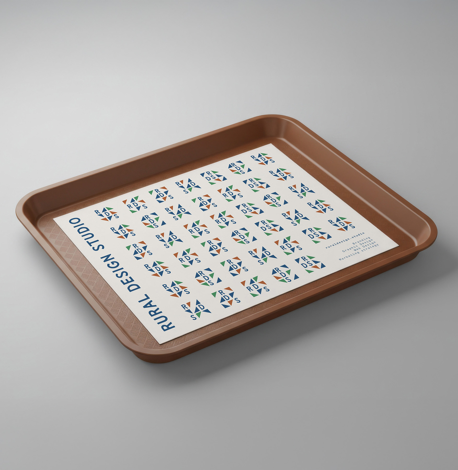
Dynamic Logo Mark
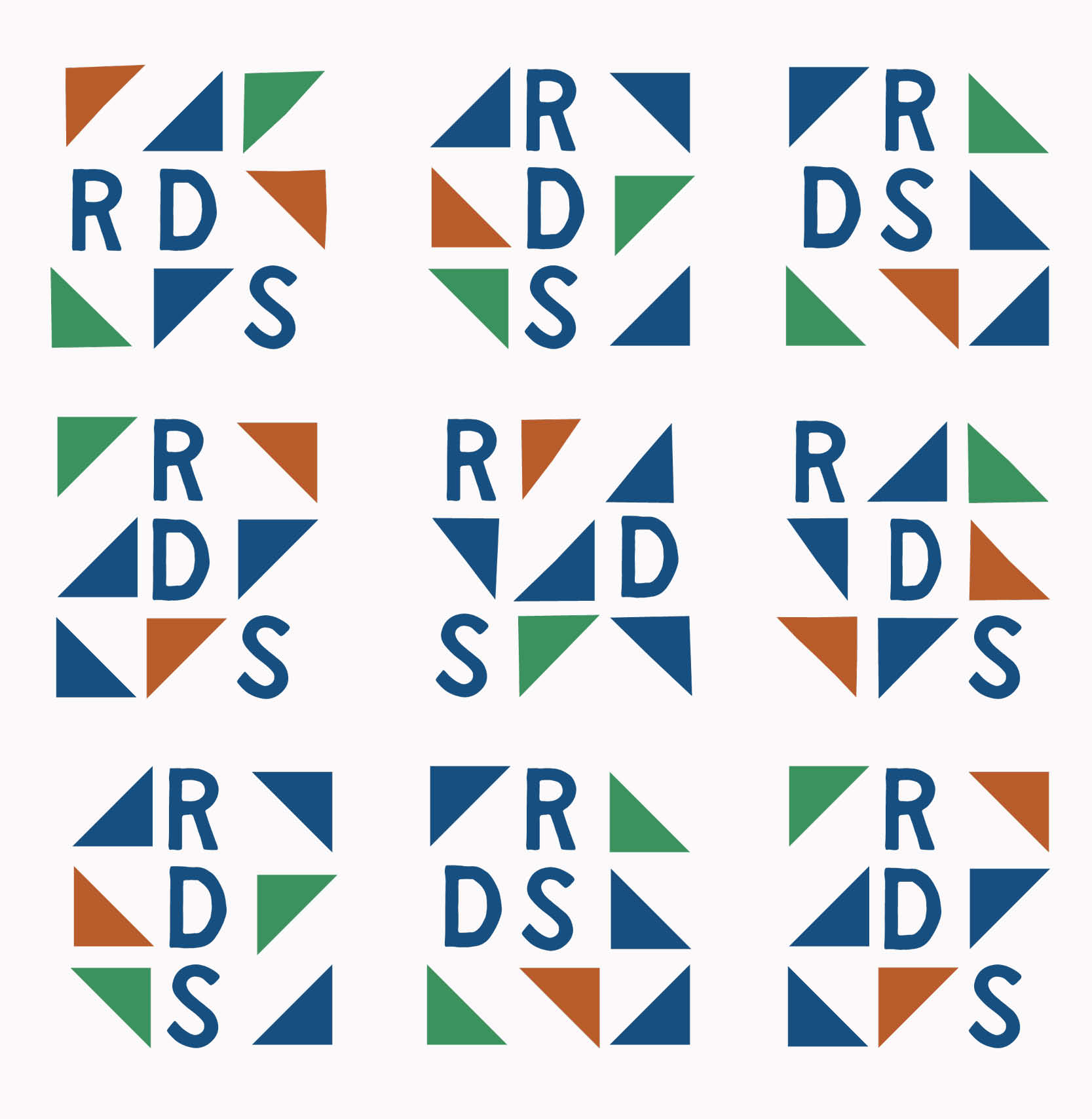
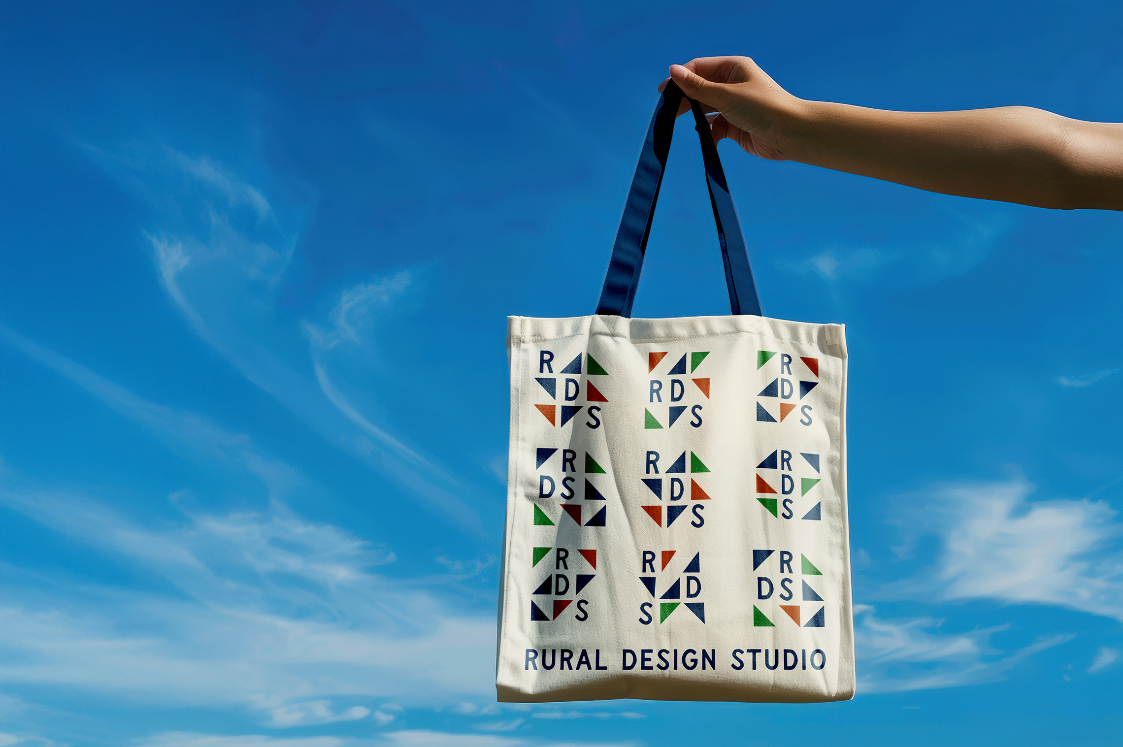
The logo mark is meant to have an infinite number of combinations, always using “RDS,” the patchworking of triangles, and brand colors.
This brand mark can be used individually or to create a pattern.
Website Design
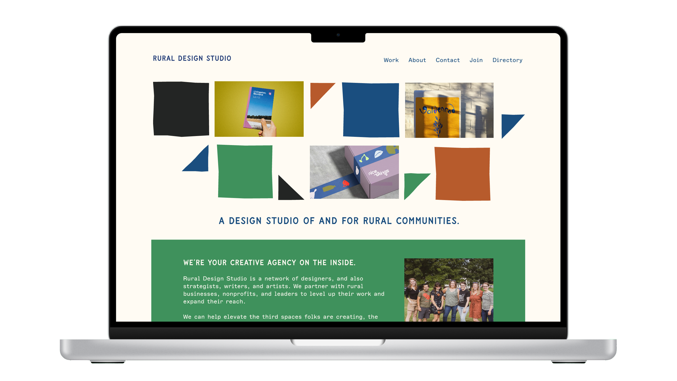
Once I established a brand identity and platform for the Rural Design Studio, I incorporated user feedback on what would be useful to see on a studio website.
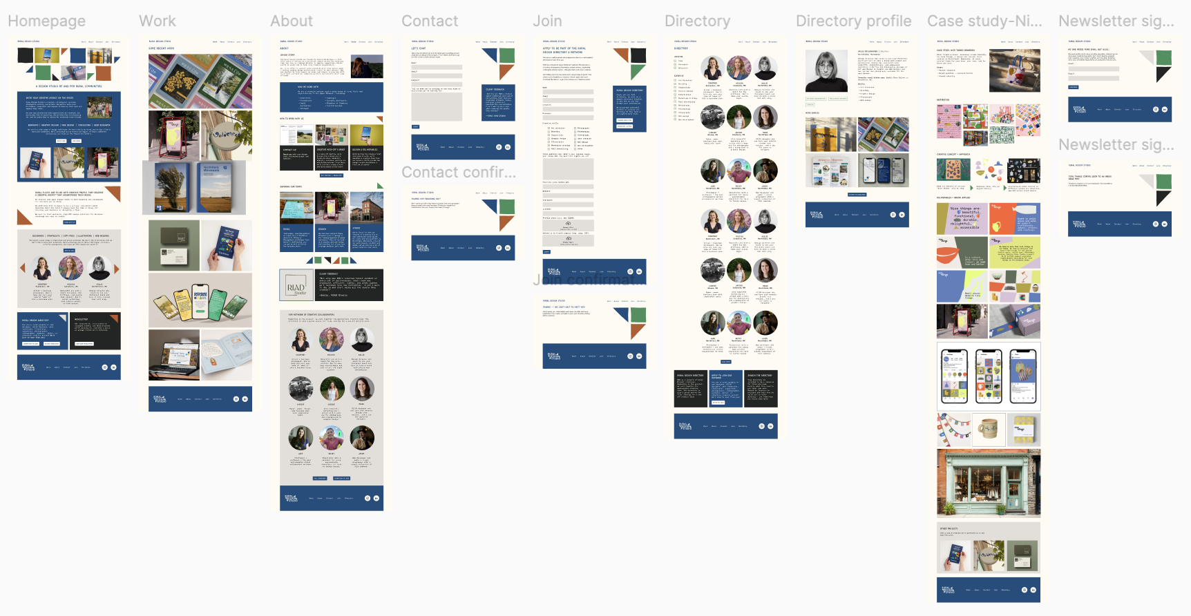
I mocked up a prototype in Figma (below). I continued to refine this prototype based on user feedback.
Mockups
I developed mockups of all key pages for the RDS website, prototyped in Figma. To align with the brand, page design incorporates some patchwork motifs, such as the triangles and squares, and some bold color blocking, while overall striving for a balance of minimalism and warmth, showcasing RDS work when possible.
See the final Figma prototype below, which incorporated feedback from both prospective clients and collaborators.